


Versus Extra Bold
2.98/5
8573 votes, rated based on results identification
Publisher
Myfonts.com
License
Commercial
Date added
Jan 23 2019
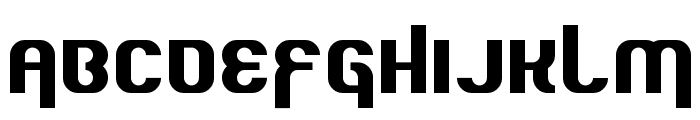
A bold, modern font with thick strokes and uniform width. This font features bold, thick strokes with a strong presence. The characters are uniformly wide, with a modern and impactful design. The uppercase and lowercase letters maintain consistent weight, making it suitable for attention-grabbing text.
Ideal for headlines, posters, branding, and logos where a strong, impactful statement is needed.
Headlines, Logos
Balanced
Download Versus Extra Bold font.
See the font with your own text
Category
Sans-Serif
Italic
No
Width
Normal
Line height
Normal
Overall style
Modern
Cap height
High
Bold
Yes
Weight
Bold
Character spacing
Normal
Contrast
Low
X height
Medium
Proposed projects
Ideal for headlines, posters, branding, and logos where a strong, impactful statement is needed.
Use case
Headlines, Logos
Ascender descender ratio
Balanced
Similar Free Fonts for Versus Extra Bold
Howser
Free for personal use

Quous Inno Regular
Free for personal use
Similar Fonts for Versus Extra Bold from Adobe.com
Aller Display Regular
$ Commercial > Adobe.com

Social Gothic Soft
$ Commercial > Adobe.com

Similar Fonts for Versus Extra Bold from MyFonts.com
Versus Extra Bold
$ Commercial > MyFonts.com
Versus Bold
$ Commercial > MyFonts.com

Similar Fonts for Versus Extra Bold from CreativeMarket.com
Versus ExtraBold otf (700)
$ Commercial > CreativeMarket.com

Versus Bold otf (700)
$ Commercial > CreativeMarket.com


Did you know? We have indexed 99% of the world's fonts!