


Versus Bold
2.91/5
7998 votes, rated based on results identification
Publisher
Myfonts.com
License
Commercial
Date added
Jan 23 2019
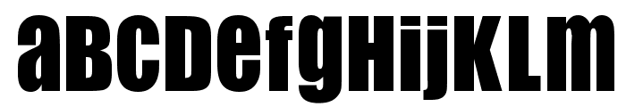
A bold, impactful font with thick strokes and uniform width. This font features bold, thick strokes with a strong presence. The characters are uniformly wide, creating a powerful and impactful look. It is highly legible and suitable for attention-grabbing designs.
Ideal for headlines, posters, branding, and advertising materials.
Headlines, Logos
Balanced
Download Versus Bold font.
See the font with your own text
Category
Sans-Serif
Italic
No
Width
Normal
Line height
Normal
Overall style
Modern
Cap height
High
Bold
Yes
Weight
Bold
Character spacing
Normal
Contrast
Low
X height
Medium
Proposed projects
Ideal for headlines, posters, branding, and advertising materials.
Use case
Headlines, Logos
Ascender descender ratio
Balanced
Similar Free Fonts for Versus Bold
Flip Flop Royal
Free for personal use

Flip Flop
Free for personal use
Similar Fonts for Versus Bold from Adobe.com
Social Gothic Stencil
$ Commercial > Adobe.com

Social Gothic Bold
$ Commercial > Adobe.com

Similar Fonts for Versus Bold from MyFonts.com
Versus Bold
$ Commercial > MyFonts.com
Versus Semi Bold
$ Commercial > MyFonts.com

Similar Fonts for Versus Bold from CreativeMarket.com
Versus SemiBold otf (600)
$ Commercial > CreativeMarket.com

Versus Bold otf (700)
$ Commercial > CreativeMarket.com


Did you know? We have indexed 99% of the world's fonts!