


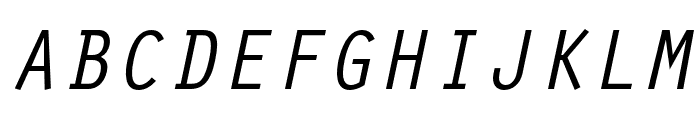
Zoning Department Oblique JNL
2.93/5
3173 votes, rated based on results identification
Publisher
Myfonts.com
License
Commercial
Date added
Nov 25 2016
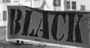
A bold, slanted font with a dynamic and energetic style. This font features a dynamic and slanted design, giving it an energetic and forward-moving appearance. The characters are bold with a slightly condensed width, creating a strong visual impact. The strokes are consistent in thickness, providing a uniform look across all characters.
Ideal for sports branding, dynamic posters, and modern advertising campaigns.
Headlines, Logos
Balanced
Download Zoning Department Oblique JNL font.
See the font with your own text
Category
Sans-Serif
Italic
Yes
Width
Condensed
Line height
Normal
Overall style
Modern
Cap height
High
Bold
Yes
Weight
Bold
Character spacing
Normal
Contrast
Low
X height
Medium
Proposed projects
Ideal for sports branding, dynamic posters, and modern advertising campaigns.
Use case
Headlines, Logos
Ascender descender ratio
Balanced
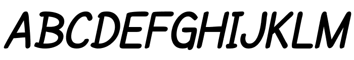
Similar Free Fonts for Zoning Department Oblique JNL
Similar Fonts for Zoning Department Oblique JNL from Adobe.com
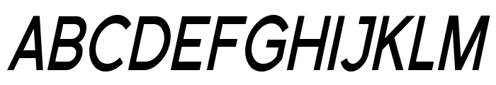
Similar Fonts for Zoning Department Oblique JNL from MyFonts.com

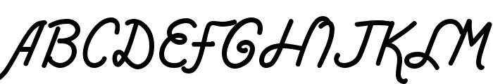
Similar Fonts for Zoning Department Oblique JNL from CreativeMarket.com


Our latest blog articles
Latest from the forum

Did you know? We have indexed 99% of the world's fonts!