


To Be Continued Regular
3.12/5
2186 votes, rated based on results identification
Publisher
Myfonts.com
License
Commercial
Date added
Dec 06 2016
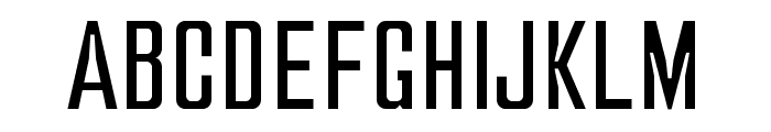
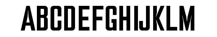
A bold, geometric, and modern font with a condensed style. This font features a bold, geometric style with sharp angles and a modern aesthetic. The characters are tall and narrow, giving it a condensed appearance. It has a clean and futuristic look, suitable for impactful designs.
Ideal for headlines, posters, and branding projects that require a modern and bold statement.
Headlines, Logos
Balanced
Download To Be Continued Regular font.
See the font with your own text
Category
Sans-Serif
Italic
No
Width
Condensed
Line height
Normal
Overall style
Modern
Cap height
High
Bold
Yes
Weight
Bold
Character spacing
Normal
Contrast
Low
X height
Medium
Proposed projects
Ideal for headlines, posters, and branding projects that require a modern and bold statement.
Use case
Headlines, Logos
Ascender descender ratio
Balanced
Similar Free Fonts for To Be Continued Regular
Similar Fonts for To Be Continued Regular from Adobe.com


Similar Fonts for To Be Continued Regular from MyFonts.com

Similar Fonts for To Be Continued Regular from CreativeMarket.com


Did you know? We have indexed 99% of the world's fonts!