

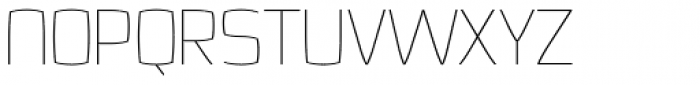
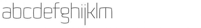
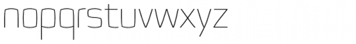

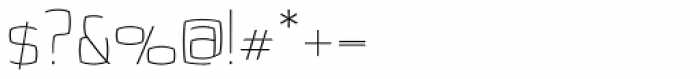
Quam Thin
2.75/5
289 votes, rated based on results identification
Publisher
Myfonts.com
License
Commercial
Date added
Nov 22 2016
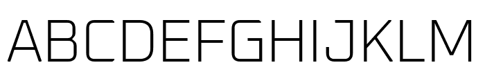
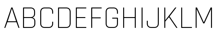
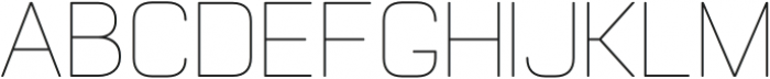
A modern, geometric font with thin strokes and sharp angles. This font features a modern, geometric design with thin, uniform strokes. The characters are clean and minimalistic, with a focus on straight lines and sharp angles. The uppercase letters are slightly taller than the lowercase, and the numerals are consistent with the overall style.
Ideal for tech branding, minimalist posters, and modern web design.
Headlines, Logos
Balanced
Download Quam Thin font.
See the font with your own text
Category
Sans-Serif
Italic
No
Width
Normal
Line height
Normal
Overall style
Modern
Cap height
High
Bold
No
Weight
Light
Character spacing
Normal
Contrast
Low
X height
Medium
Proposed projects
Ideal for tech branding, minimalist posters, and modern web design.
Use case
Headlines, Logos
Ascender descender ratio
Balanced
Similar Free Fonts for Quam Thin
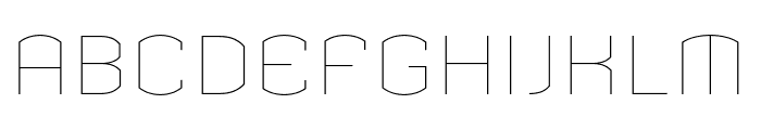
Oxanium ExtraLight
Free for personal use
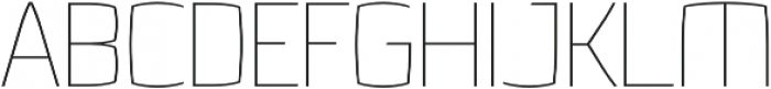
Rajdhani Light
Free for personal use
Similar Fonts for Quam Thin from Adobe.com
Armada Thin
$ Commercial > Adobe.com

Armada ThinCompressed
$ Commercial > Adobe.com
Similar Fonts for Quam Thin from MyFonts.com
Quam Thin
$ Commercial > MyFonts.com
FS Untitled Thin 100
$ Commercial > MyFonts.com

Similar Fonts for Quam Thin from CreativeMarket.com
Quam Thin otf (100)
$ Commercial > CreativeMarket.com
Nexium Round Thin otf (100)
$ Commercial > CreativeMarket.com
Did you know? We have indexed 99% of the world's fonts!