


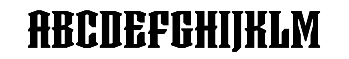
Oakters Regular
2.78/5
222 votes, rated based on results identification
Publisher
Myfonts.com
License
Commercial
Date added
Jul 30 2023
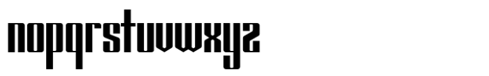
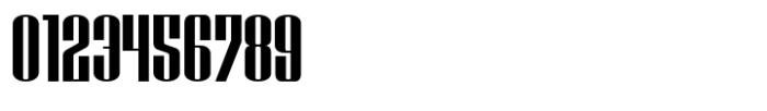
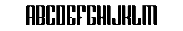
A bold, geometric, and condensed font with strong vertical emphasis. This font features bold, geometric letterforms with a strong vertical emphasis. The characters are condensed with minimal spacing, creating a compact and impactful appearance. The design is modern and assertive, suitable for making a statement.
Ideal for headlines, posters, branding, and any project requiring a bold statement.
Headlines, Logos
Balanced
Download Oakters Regular font.
See the font with your own text
Category
Decorative/Display
Italic
No
Width
Condensed
Line height
Short
Overall style
Modern
Cap height
High
Bold
Yes
Weight
Bold
Character spacing
Tight
Contrast
High
X height
Medium
Proposed projects
Ideal for headlines, posters, branding, and any project requiring a bold statement.
Use case
Headlines, Logos
Ascender descender ratio
Balanced
Similar Free Fonts for Oakters Regular
Similar Fonts for Oakters Regular from Adobe.com
Empire Black
$ Commercial > Adobe.com

Taurunum Ferrum Iron
$ Commercial > Adobe.com
Similar Fonts for Oakters Regular from MyFonts.com
Oakters Regular
$ Commercial > MyFonts.com
Shtozer 500 Condensed
$ Commercial > MyFonts.com

Similar Fonts for Oakters Regular from CreativeMarket.com
Oakters otf (400)
$ Commercial > CreativeMarket.com

Daimon-Regular otf (400)
$ Commercial > CreativeMarket.com

Our latest blog articles

Did you know? We have indexed 99% of the world's fonts!