


Normande BQ Condensed
2.99/5
7807 votes, rated based on results identification
Publisher
Myfonts.com
License
Commercial
Date added
Dec 06 2016
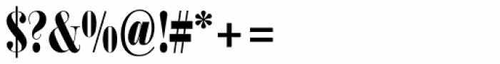
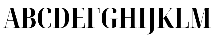
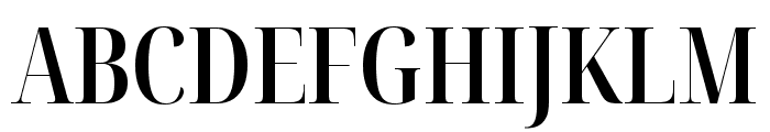
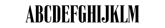
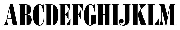
A bold, condensed font with high contrast strokes. This font features a bold and condensed style with high contrast between thick and thin strokes. The uppercase letters are tall and commanding, while the lowercase letters maintain a consistent height. The numerals and special characters are designed to match the boldness of the alphabet.
Ideal for headlines, posters, and branding materials that require a strong visual impact.
Headlines, Logos
Balanced
Download Normande BQ Condensed font.
See the font with your own text
Category
Slab Serif
Italic
No
Width
Condensed
Line height
Short
Overall style
Modern
Cap height
High
Bold
Yes
Weight
Bold
Character spacing
Tight
Contrast
High
X height
Medium
Proposed projects
Ideal for headlines, posters, and branding materials that require a strong visual impact.
Use case
Headlines, Logos
Ascender descender ratio
Balanced
Similar Free Fonts for Normande BQ Condensed
Noto Serif Display ExtraCondensed Bold
Free for personal use
Noto Serif Display ExtraCondensed SemiBold
Free for personal use
Similar Fonts for Normande BQ Condensed from Adobe.com
Vincente ExtraBold
$ Commercial > Adobe.com
BodoniFB BoldCompressed
$ Commercial > Adobe.com
Similar Fonts for Normande BQ Condensed from MyFonts.com
Normande BQ Condensed
$ Commercial > MyFonts.com
Liliom Pro
$ Commercial > MyFonts.com

Similar Fonts for Normande BQ Condensed from CreativeMarket.com
Didonesque Lite Medium Condensed otf (500)
$ Commercial > CreativeMarket.com

Perfectly Nostalgic ttf (400)
$ Commercial > CreativeMarket.com

Did you know? We have indexed 99% of the world's fonts!