


Nok SC Expanded
2.93/5
1581 votes, rated based on results identification
Publisher
Myfonts.com
License
Commercial
Date added
Dec 05 2016
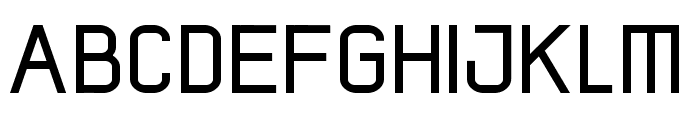
A clean, geometric font with an expanded, narrow style. This font features a clean, geometric design with uniform stroke widths. The characters are tall and narrow, giving an expanded appearance. The uppercase and lowercase letters maintain a consistent style, with sharp angles and straight lines.
Ideal for modern branding, headlines, and signage where a sleek, contemporary look is desired.
Headlines, Logos, Signage
Balanced
Download Nok SC Expanded font.
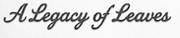
See the font with your own text
Category
Sans-Serif
Italic
No
Width
Expanded
Line height
Tall
Overall style
Modern
Cap height
High
Bold
No
Weight
Regular
Character spacing
Normal
Contrast
Low
X height
Medium
Proposed projects
Ideal for modern branding, headlines, and signage where a sleek, contemporary look is desired.
Use case
Headlines, Logos, Signage
Ascender descender ratio
Balanced
Similar Free Fonts for Nok SC Expanded
screenman
Free for personal use
GABOED thin
Free for personal use

Similar Fonts for Nok SC Expanded from Adobe.com
Poster Gothic ATF Light
$ Commercial > Adobe.com

Poster Gothic Round ATF Light
$ Commercial > Adobe.com

Similar Fonts for Nok SC Expanded from MyFonts.com
Nok SC Expanded
$ Commercial > MyFonts.com
Nok SC
$ Commercial > MyFonts.com

Similar Fonts for Nok SC Expanded from CreativeMarket.com
Orecla Regular otf (400)
$ Commercial > CreativeMarket.com

Protrakt Medium otf (500)
$ Commercial > CreativeMarket.com


Did you know? We have indexed 99% of the world's fonts!