


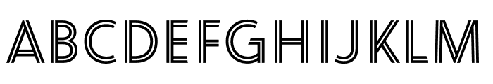
Linem Up JNL
2.87/5
1234 votes, rated based on results identification
Publisher
Myfonts.com
License
Commercial
Date added
Nov 28 2016
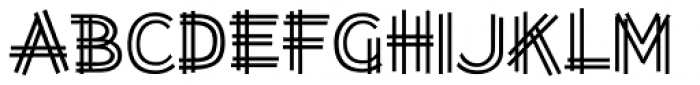
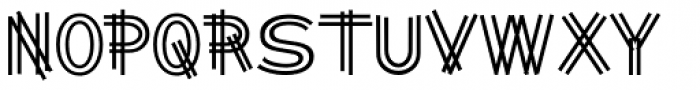
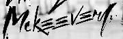
A geometric, layered font with intersecting lines. This font features a unique, geometric design with multiple horizontal lines intersecting each character, creating a layered effect. The characters are bold and structured, giving a modern and architectural feel.
Ideal for modern branding, architectural designs, and creative posters.
Logos, Posters, Headlines
Balanced
Download Linem Up JNL font.
See the font with your own text
Category
Decorative/Display
Italic
No
Width
Normal
Line height
Normal
Overall style
Modern
Cap height
High
Bold
Yes
Weight
Bold
Character spacing
Normal
Contrast
Low
X height
Medium
Proposed projects
Ideal for modern branding, architectural designs, and creative posters.
Use case
Logos, Posters, Headlines
Ascender descender ratio
Balanced
Similar Fonts for Linem Up JNL from Adobe.com

Similar Fonts for Linem Up JNL from MyFonts.com
Similar Fonts for Linem Up JNL from CreativeMarket.com


Did you know? We have indexed 99% of the world's fonts!