


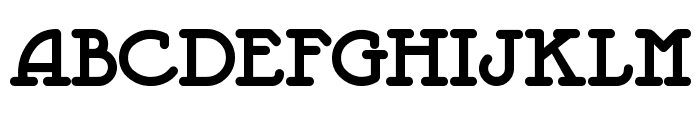
Jeepers Std
2.96/5
1913 votes, rated based on results identification
Publisher
Myfonts.com
License
Commercial
Date added
Dec 06 2016
A playful, bold font with rounded edges and consistent stroke width. This font features a playful and bold style with rounded edges and a slightly whimsical appearance. The characters are thick and have a consistent stroke width, giving it a sturdy and approachable look.
Ideal for children's books, playful branding, posters, and casual invitations.
Headlines, Logos
Balanced
Download Jeepers Std font.
See the font with your own text
Category
Decorative/Display
Italic
No
Width
Normal
Line height
Normal
Overall style
Playful
Cap height
High
Bold
Yes
Weight
Bold
Character spacing
Normal
Contrast
Low
X height
Medium
Proposed projects
Ideal for children's books, playful branding, posters, and casual invitations.
Use case
Headlines, Logos
Ascender descender ratio
Balanced
Similar Free Fonts for Jeepers Std
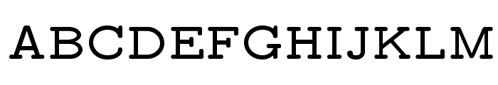
Jeepers
Free for personal use
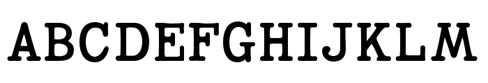
LMMonoPropLt10-Bold
Free for personal use
Similar Fonts for Jeepers Std from Adobe.com
Mortise Bold
$ Commercial > Adobe.com

Coronette Regular
$ Commercial > Adobe.com
Similar Fonts for Jeepers Std from MyFonts.com
Jeepers Std
$ Commercial > MyFonts.com
Jeepers
$ Commercial > MyFonts.com

Similar Fonts for Jeepers Std from CreativeMarket.com
Typewriter Spool CLN Extended Bold otf (700)
$ Commercial > CreativeMarket.com

Warlow Slab Distorted otf (400)
$ Commercial > CreativeMarket.com


Did you know? We have indexed 99% of the world's fonts!