


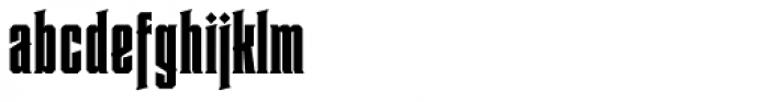


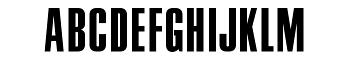
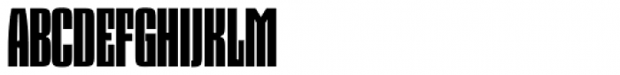
Heretic Condensed
3.11/5
2016 votes, rated based on results identification
Publisher
Myfonts.com
License
Commercial
Date added
Dec 05 2016
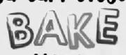
A bold, condensed serif font with sharp serifs and tight spacing. This font features a bold, condensed style with strong vertical strokes and sharp serifs. The characters are tightly spaced, giving it a compact appearance. The uppercase letters are tall and imposing, while the lowercase letters maintain a consistent height. The numbers and special characters follow the same bold and condensed design.
Ideal for headlines, posters, and branding materials where a strong, impactful presence is needed.
Headlines, Logos
Balanced
Download Heretic Condensed font.
See the font with your own text
Category
Serif
Italic
No
Width
Condensed
Line height
Short
Overall style
Modern
Cap height
High
Bold
Yes
Weight
Bold
Character spacing
Tight
Contrast
High
X height
Medium
Proposed projects
Ideal for headlines, posters, and branding materials where a strong, impactful presence is needed.
Use case
Headlines, Logos
Ascender descender ratio
Balanced
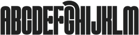
Similar Free Fonts for Heretic Condensed
OPTIPermanent-Headline
Free for personal use
Aka-AcidGR-Compacta
Free for personal use

Similar Fonts for Heretic Condensed from Adobe.com
Pressio No. 35 Black Compressed
$ Commercial > Adobe.com

Taboo Pro Bold
$ Commercial > Adobe.com

Similar Fonts for Heretic Condensed from MyFonts.com
Heretic Condensed
$ Commercial > MyFonts.com
Dez Squeeze Pro Tight
$ Commercial > MyFonts.com
Similar Fonts for Heretic Condensed from CreativeMarket.com
MUSCULARSTRENGTH-Bold otf (700)
$ Commercial > CreativeMarket.com
DisplayCarlos otf (400)
$ Commercial > CreativeMarket.com


Did you know? We have indexed 99% of the world's fonts!