

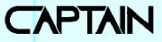
First Prize UP Semi Light
2.85/5
130 votes, rated based on results identification
Publisher
Myfonts.com
License
Commercial
Date added
Jul 29 2023
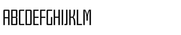
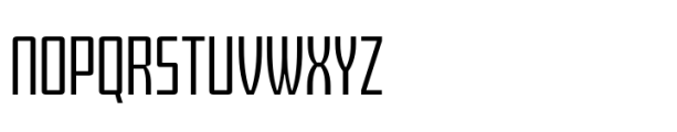
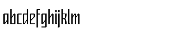
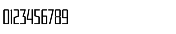
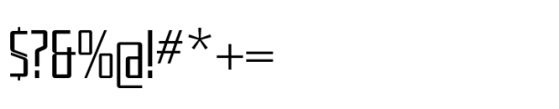
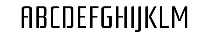
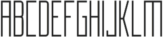
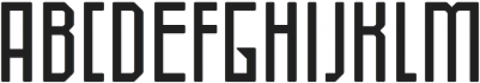
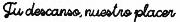
A modern, geometric font with clean lines and a structured appearance. This font features a modern, geometric style with clean lines and a slightly condensed appearance. The characters are uniform in width, giving it a structured and organized look. The strokes are consistent, with a medium contrast between thick and thin parts.
Ideal for branding, headlines, posters, and modern web design.
Headlines, Logos
Balanced
Download First Prize UP Semi Light font.
See the font with your own text
Category
Sans-Serif
Italic
No
Width
Condensed
Line height
Normal
Overall style
Modern
Cap height
High
Bold
No
Weight
Light
Character spacing
Normal
Contrast
Medium
X height
Medium
Proposed projects
Ideal for branding, headlines, posters, and modern web design.
Use case
Headlines, Logos
Ascender descender ratio
Balanced
Similar Free Fonts for First Prize UP Semi Light
Solid Sound 101 Regular
Free for personal use

Rationale
Free for personal use
Similar Fonts for First Prize UP Semi Light from Adobe.com
Teko Light
$ Commercial > Adobe.com

Apotek ExtraCond Light
$ Commercial > Adobe.com

Similar Fonts for First Prize UP Semi Light from MyFonts.com
First Prize UP Semi Light
$ Commercial > MyFonts.com
First Prize UP Light
$ Commercial > MyFonts.com

Similar Fonts for First Prize UP Semi Light from CreativeMarket.com
Manurewah otf (400)
$ Commercial > CreativeMarket.com
Talin otf (400)
$ Commercial > CreativeMarket.com
Our latest blog articles
Latest from the forum
Did you know? We have indexed 99% of the world's fonts!