


Finery JNL
2.94/5
565 votes, rated based on results identification
Publisher
Myfonts.com
License
Commercial
Date added
Nov 23 2016
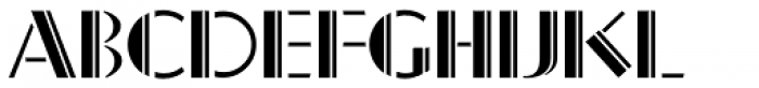
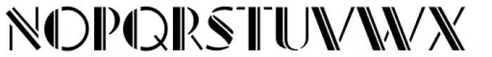
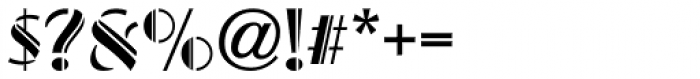
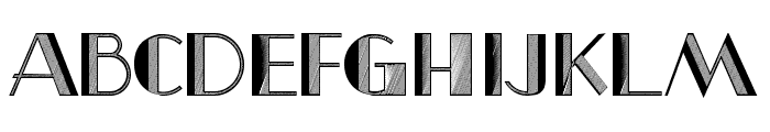
A modern, geometric font with high contrast and sharp angles. This font features a modern, geometric design with high contrast between thick and thin strokes. The characters are sharply angled, creating a dynamic and stylish appearance. The uppercase letters are particularly bold and striking, while the numerals and special characters maintain the same aesthetic.
Ideal for branding, logos, and headlines where a bold, modern look is desired.
Headlines, Logos
Balanced
Download Finery JNL font.
See the font with your own text
Category
Decorative/Display
Italic
No
Width
Normal
Line height
Normal
Overall style
Modern
Cap height
High
Bold
Yes
Weight
Bold
Character spacing
Normal
Contrast
High
X height
Medium
Proposed projects
Ideal for branding, logos, and headlines where a bold, modern look is desired.
Use case
Headlines, Logos
Ascender descender ratio
Balanced
Similar Free Fonts for Finery JNL
Similar Fonts for Finery JNL from Adobe.com


Similar Fonts for Finery JNL from MyFonts.com

Similar Fonts for Finery JNL from CreativeMarket.com


Our latest blog articles

Did you know? We have indexed 99% of the world's fonts!