


Fenomen Slab SCN Book
2.81/5
3748 votes, rated based on results identification
Publisher
Myfonts.com
License
Commercial
Date added
Jul 26 2017
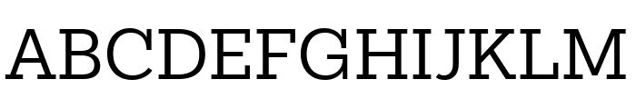
A strong slab serif font with consistent stroke width and clear readability. This font features a robust slab serif design with strong, rectangular serifs. The characters are well-balanced with a consistent stroke width, giving it a solid and reliable appearance. The uppercase letters are bold and commanding, while the lowercase letters maintain a harmonious flow. Numbers and special characters are clearly defined, enhancing readability.
Ideal for editorial design, book covers, branding, and signage where a classic yet bold statement is needed.
Headlines, Body text, Logos
Balanced
Download Fenomen Slab SCN Book font.
See the font with your own text
Category
Slab Serif
Italic
No
Width
Normal
Line height
Normal
Overall style
Classic
Cap height
High
Bold
No
Weight
Regular
Character spacing
Normal
Contrast
Low
X height
Medium
Proposed projects
Ideal for editorial design, book covers, branding, and signage where a classic yet bold statement is needed.
Use case
Headlines, Body text, Logos
Ascender descender ratio
Balanced
Similar Free Fonts for Fenomen Slab SCN Book
Street Slab
Free for personal use

Josefov
Free for personal use

Similar Fonts for Fenomen Slab SCN Book from Adobe.com
Mokoko Regular
$ Commercial > Adobe.com
Karbid Slab Pro Regular
$ Commercial > Adobe.com

Similar Fonts for Fenomen Slab SCN Book from MyFonts.com
Fenomen Slab SCN Book
$ Commercial > MyFonts.com
Fenomen Slab SCN Light
$ Commercial > MyFonts.com

Similar Fonts for Fenomen Slab SCN Book from CreativeMarket.com
OkojoSlabPro otf (400)
$ Commercial > CreativeMarket.com

Queulat Cnd Soft otf (400)
$ Commercial > CreativeMarket.com


Did you know? We have indexed 99% of the world's fonts!