


Equalis
2.87/5
1252 votes, rated based on results identification
Publisher
Myfonts.com
License
Commercial
Date added
Nov 27 2016
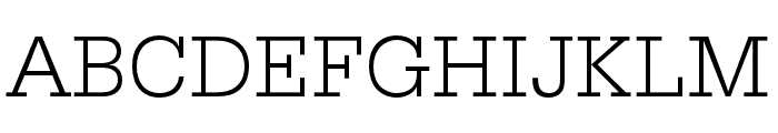
A modern, geometric font with balanced proportions and consistent stroke width. This font features a clean and modern design with a geometric structure. The characters are evenly spaced with a consistent stroke width, providing a balanced and professional appearance. The uppercase and lowercase letters are well-proportioned, and the numerals are clear and legible.
Ideal for branding, editorial design, and digital interfaces.
Headlines, Body text, Logos
Balanced
Download Equalis font.
See the font with your own text
Category
Sans-Serif
Italic
No
Width
Normal
Line height
Normal
Overall style
Modern
Cap height
High
Bold
No
Weight
Regular
Character spacing
Normal
Contrast
Low
X height
Medium
Proposed projects
Ideal for branding, editorial design, and digital interfaces.
Use case
Headlines, Body text, Logos
Ascender descender ratio
Balanced
Similar Free Fonts for Equalis


Similar Fonts for Equalis from Adobe.com

Similar Fonts for Equalis from MyFonts.com

Similar Fonts for Equalis from CreativeMarket.com


Did you know? We have indexed 99% of the world's fonts!