


Early Edition JNL Oblique
2.97/5
2663 votes, rated based on results identification
Publisher
Myfonts.com
License
Commercial
Date added
Jun 04 2020
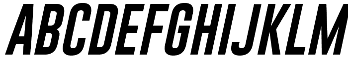
Bold, oblique font with tight spacing and strong presence. This font features bold, oblique characters with a strong, dynamic presence. The letters are tightly spaced, creating a sense of urgency and movement. The strokes are thick and consistent, giving it a robust and impactful appearance.
Ideal for headlines, posters, and branding materials that require a bold statement.
Headlines, Logos
Balanced
Download Early Edition JNL Oblique font.
See the font with your own text
Category
Sans-Serif
Italic
Yes
Width
Condensed
Line height
Short
Overall style
Modern
Cap height
High
Bold
Yes
Weight
Bold
Character spacing
Tight
Contrast
Low
X height
Medium
Proposed projects
Ideal for headlines, posters, and branding materials that require a bold statement.
Use case
Headlines, Logos
Ascender descender ratio
Balanced
Similar Free Fonts for Early Edition JNL Oblique

Similar Fonts for Early Edition JNL Oblique from Adobe.com


Similar Fonts for Early Edition JNL Oblique from MyFonts.com

Similar Fonts for Early Edition JNL Oblique from CreativeMarket.com


Did you know? We have indexed 99% of the world's fonts!