


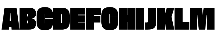
Dime Solid
2.84/5
3201 votes, rated based on results identification
Publisher
Myfonts.com
License
Commercial
Date added
Nov 23 2016
Bold, geometric, and solid with a playful yet assertive style. This font features bold, geometric letterforms with a solid, blocky appearance. The characters are uniformly thick, with minimal contrast between strokes, giving it a strong and impactful look. The style is playful yet assertive, making it suitable for eye-catching designs.
Ideal for posters, headlines, logos, and branding materials that require a strong visual impact.
Headlines, Logos
Balanced
Download Dime Solid font.
See the font with your own text
Category
Decorative/Display
Italic
No
Width
Normal
Line height
Normal
Overall style
Modern
Cap height
High
Bold
Yes
Weight
Bold
Character spacing
Normal
Contrast
Low
X height
Medium
Proposed projects
Ideal for posters, headlines, logos, and branding materials that require a strong visual impact.
Use case
Headlines, Logos
Ascender descender ratio
Balanced
Similar Free Fonts for Dime Solid
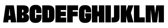
FatmanBlack
Free for personal use

Decalotype Black
Free for personal use

Similar Fonts for Dime Solid from Adobe.com
Antarctican Headline Ultrablack
$ Commercial > Adobe.com
Antarctican Headline Ultrabold
$ Commercial > Adobe.com
Similar Fonts for Dime Solid from MyFonts.com
Dime Solid
$ Commercial > MyFonts.com
Herokid Heavy Narrow
$ Commercial > MyFonts.com

Similar Fonts for Dime Solid from CreativeMarket.com
Specify Condensed otf (900)
$ Commercial > CreativeMarket.com

Config Black otf (900)
$ Commercial > CreativeMarket.com


Did you know? We have indexed 99% of the world's fonts!