


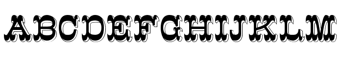
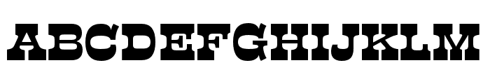
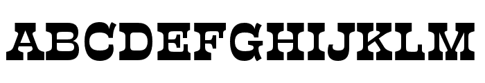
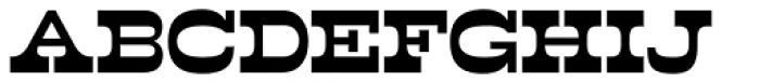
Dime Museum
3.06/5
2206 votes, rated based on results identification
Publisher
Myfonts.com
License
Commercial
Date added
Dec 07 2016
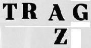
Bold slab serif font with a vintage, sturdy look. This font features bold, slab serif characters with a strong presence. The letters are thick and blocky, giving a vintage and sturdy appearance. The serifs are prominent and squared, adding to the overall boldness of the design.
Ideal for posters, headlines, branding, and signage where a strong, impactful statement is needed.
Headlines, Logos, Posters
Balanced
Download Dime Museum font.
See the font with your own text
Category
Slab Serif
Italic
No
Width
Normal
Line height
Normal
Overall style
Vintage
Cap height
High
Bold
Yes
Weight
Bold
Character spacing
Normal
Contrast
Low
X height
Medium
Proposed projects
Ideal for posters, headlines, branding, and signage where a strong, impactful statement is needed.
Use case
Headlines, Logos, Posters
Ascender descender ratio
Balanced
Similar Free Fonts for Dime Museum
Similar Fonts for Dime Museum from Adobe.com
Similar Fonts for Dime Museum from MyFonts.com
Similar Fonts for Dime Museum from CreativeMarket.com


Did you know? We have indexed 99% of the world's fonts!