
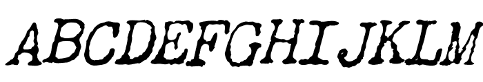
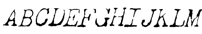
Dear John Uneven Italic
2.90/5
1143 votes, rated based on results identification
Publisher
Myfonts.com
License
Commercial
Date added
Dec 07 2016
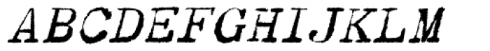
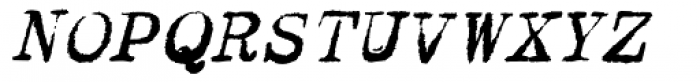
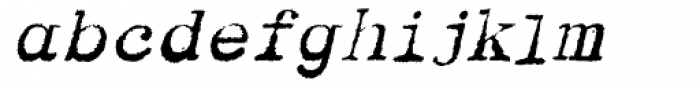
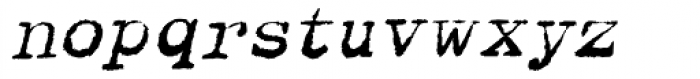
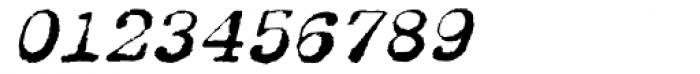
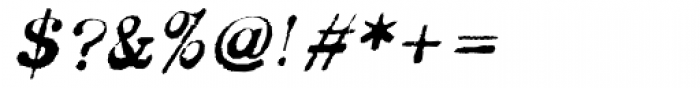
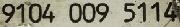
A distressed, italicized font with a vintage, hand-drawn look. This font features an uneven, distressed appearance with italicized characters. The strokes are rough and textured, giving it a hand-drawn, vintage feel. The letters are slightly slanted, enhancing the italic style.
Ideal for vintage-themed designs, posters, and artistic projects that require a rustic or handmade aesthetic.
Headlines, Artistic projects, Posters
Balanced
Download Dear John Uneven Italic font.
See the font with your own text
Category
Decorative/Display
Italic
Yes
Width
Normal
Line height
Normal
Overall style
Vintage
Cap height
High
Bold
No
Weight
Regular
Character spacing
Normal
Contrast
Medium
X height
Medium
Proposed projects
Ideal for vintage-themed designs, posters, and artistic projects that require a rustic or handmade aesthetic.
Use case
Headlines, Artistic projects, Posters
Ascender descender ratio
Balanced
Similar Free Fonts for Dear John Uneven Italic
Similar Fonts for Dear John Uneven Italic from Adobe.com
Similar Fonts for Dear John Uneven Italic from MyFonts.com

Similar Fonts for Dear John Uneven Italic from CreativeMarket.com

Did you know? We have indexed 99% of the world's fonts!