
Better Part Of Me Regular
2.96/5
427 votes, rated based on results identification
Publisher
Myfonts.com
License
Commercial
Date added
May 29 2023
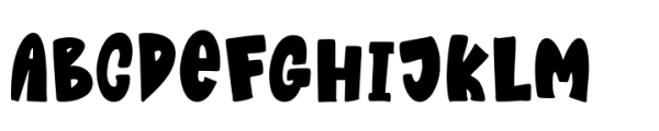
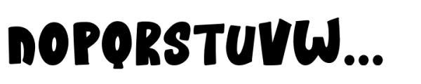
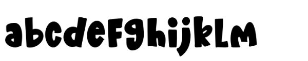
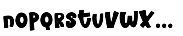
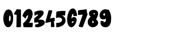
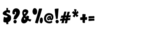
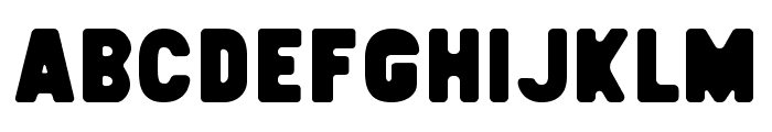
A bold, playful font with a whimsical and informal style. This font features bold, playful characters with a whimsical and informal style. The letters have a slightly uneven baseline, adding to its quirky charm. It is highly legible with a strong presence, making it suitable for eye-catching designs.
Ideal for children's books, playful branding, posters, and creative projects.
Headlines, Posters, Branding
Balanced
Download Better Part Of Me Regular font.
See the font with your own text
Category
Decorative/Display
Italic
No
Width
Normal
Line height
Normal
Overall style
Playful, Whimsical
Cap height
High
Bold
Yes
Weight
Bold
Character spacing
Normal
Contrast
Low
X height
Medium
Proposed projects
Ideal for children's books, playful branding, posters, and creative projects.
Use case
Headlines, Posters, Branding
Ascender descender ratio
Balanced
Similar Free Fonts for Better Part Of Me Regular
DINOTOONS
Free for personal use

Elsewhere Fill Regular
Free for personal use
Similar Fonts for Better Part Of Me Regular from Adobe.com
Quiroh Heavy
$ Commercial > Adobe.com

Nitti Grotesk Condensed Ultra
$ Commercial > Adobe.com

Similar Fonts for Better Part Of Me Regular from MyFonts.com
Better Part Of Me Regular
$ Commercial > MyFonts.com
Sneakerhead BTN Cond
$ Commercial > MyFonts.com

Similar Fonts for Better Part Of Me Regular from CreativeMarket.com
DINOTOONS ttf (400)
$ Commercial > CreativeMarket.com

Mini Bakers Co - Block Regular otf (400)
$ Commercial > CreativeMarket.com


Did you know? We have indexed 99% of the world's fonts!