
KG Two is Better Than One Regular
3.85/5
2444 votes, rated based on results identification
Publisher
FontSpring.com
License
Commercial
Date added
Dec 17 2016
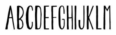
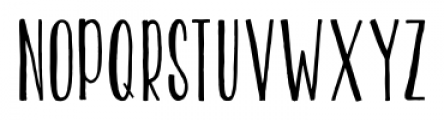
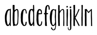
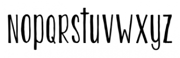
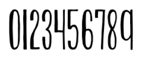
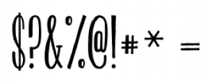
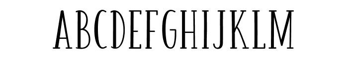
A tall, narrow, hand-drawn font with a playful style. This font features tall, narrow letters with a hand-drawn aesthetic. The strokes are slightly uneven, giving it a casual and playful feel. The uppercase and lowercase letters maintain a consistent style, with a slight slant adding to its informal charm.
Ideal for greeting cards, children's books, playful branding, and casual invitations.
Headlines, Logos
Moderate
Download KG Two is Better Than One Regular font. KG Two is Better Than One Regular by Kimberly Geswein Fonts
See the font with your own text
Category
Handwritten
Italic
No
Width
Condensed
Line height
Tall
Overall style
Casual
Cap height
High
Bold
No
Weight
Regular
Character spacing
Normal
Contrast
Low
X height
Medium
Proposed projects
Ideal for greeting cards, children's books, playful branding, and casual invitations.
Use case
Headlines, Logos
Ascender descender ratio
Moderate
Similar Free Fonts for KG Two is Better Than One Regular
KG Two is Better Than One
Free for personal use

HONEY&JAM Regular
Free for personal use
Similar Fonts for KG Two is Better Than One Regular from Adobe.com
LiebeErika Medium
$ Commercial > Adobe.com

Mezz Std Light
$ Commercial > Adobe.com

Similar Fonts for KG Two is Better Than One Regular from MyFonts.com
KG Two Is Better Than One
$ Commercial > MyFonts.com

Pentathlon Pro Ultra Light
$ Commercial > MyFonts.com

Similar Fonts for KG Two is Better Than One Regular from CreativeMarket.com
Jiraiya Regular otf (400)
$ Commercial > CreativeMarket.com
Honey&Jam otf (400)
$ Commercial > CreativeMarket.com

Did you know? We have indexed 99% of the world's fonts!