


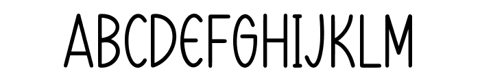
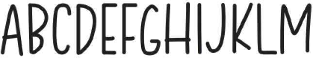
KG Two is Better Than One
3.67/5
3513 votes, rated based on results identification
Publisher
License
Free for personal use
Date added
Jan 11 2017
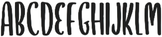
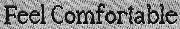
A tall, narrow, and playful hand-drawn font. This font features tall, narrow letters with a playful and slightly irregular style. The strokes are consistent in width, giving it a clean appearance. The characters have a hand-drawn feel, adding a whimsical touch.
Ideal for children's books, playful branding, and creative posters.
Headlines, Logos
Other
Download KG Two is Better Than One font. KG Two is Better Than One by Copyright [c] 2012 by Kimberly Geswein. All rights reserved.
See the font with your own text
Category
Handwritten
Italic
No
Width
Condensed
Line height
Tall
Overall style
Playful
Cap height
High
Bold
No
Weight
Regular
Character spacing
Normal
Contrast
Low
X height
Medium
Proposed projects
Ideal for children's books, playful branding, and creative posters.
Use case
Headlines, Logos
Ascender descender ratio
Other
Similar Free Fonts for KG Two is Better Than One
KG Two is Better Than One
Free for personal use
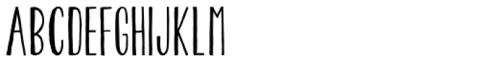
SweetMorning
Free for personal use
Similar Fonts for KG Two is Better Than One from Adobe.com
Pilot Regular
$ Commercial > Adobe.com

Fairweather Light
$ Commercial > Adobe.com

Similar Fonts for KG Two is Better Than One from MyFonts.com
KG Two Is Better Than One
$ Commercial > MyFonts.com
Pentathlon Pro Ultra Light
$ Commercial > MyFonts.com
Similar Fonts for KG Two is Better Than One from CreativeMarket.com
Jiraiya Regular otf (400)
$ Commercial > CreativeMarket.com
Bancakan Narrow otf (400)
$ Commercial > CreativeMarket.com
Did you know? We have indexed 99% of the world's fonts!