

just that neat
2.96/5
1846 votes, rated based on results identification
Publisher
License
Free for personal use
Date added
Jan 10 2017
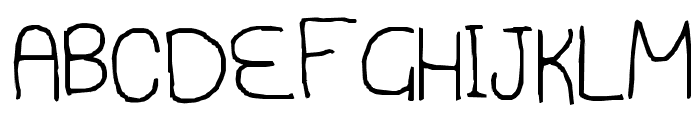
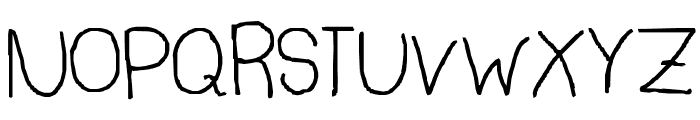
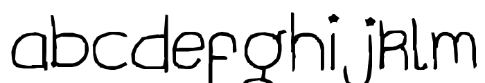
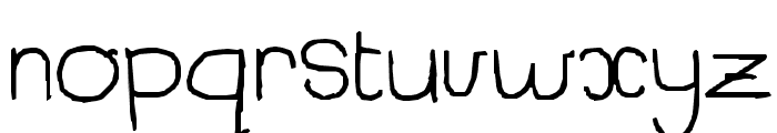
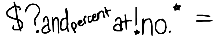
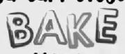
A playful, handwritten font with irregular strokes. This font features a playful, handwritten style with irregular strokes and a casual appearance. The characters have a slightly uneven baseline, adding to the informal and friendly look.
Ideal for children's books, casual invitations, and creative projects.
Headlines, Informal text, Creative projects
Balanced
Download just that neat font. just that neat by ivecn [C] 2010
See the font with your own text
Category
Handwritten
Italic
No
Width
Normal
Line height
Normal
Overall style
Casual
Cap height
Medium
Bold
No
Weight
Regular
Character spacing
Normal
Contrast
Low
X height
Medium
Proposed projects
Ideal for children's books, casual invitations, and creative projects.
Use case
Headlines, Informal text, Creative projects
Ascender descender ratio
Balanced
Similar Free Fonts for just that neat
just that neat
Free for personal use
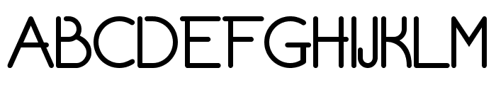
Chivilcoyana Regular Beta
Free for personal use
Similar Fonts for just that neat from Adobe.com
Auger Mono X Light
$ Commercial > Adobe.com
Auger Mono Light
$ Commercial > Adobe.com

Similar Fonts for just that neat from MyFonts.com
KG Chasing Pavements
$ Commercial > MyFonts.com

Galica Thin
$ Commercial > MyFonts.com

Similar Fonts for just that neat from CreativeMarket.com
Emphatic Light otf (300)
$ Commercial > CreativeMarket.com

Monolog Light otf (300)
$ Commercial > CreativeMarket.com


Did you know? We have indexed 99% of the world's fonts!