
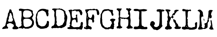
Why do we blink so frequently? Dark
3.12/5
4086 votes, rated based on results identification
Publisher
License
Free for personal use
Date added
Dec 06 2017
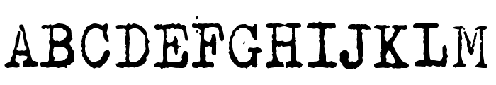
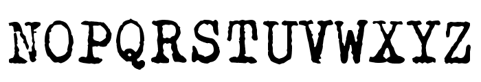
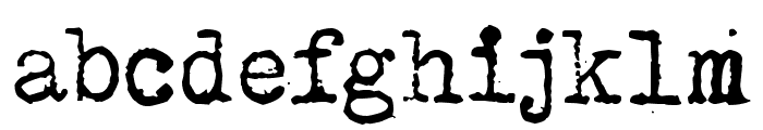
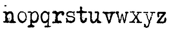
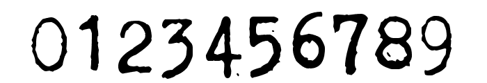
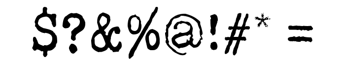
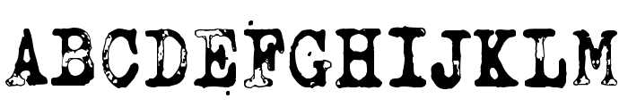
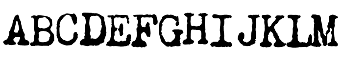
A distressed, vintage-style font with a grunge texture. This font features a distressed, grunge style with uneven edges and a textured appearance, reminiscent of typewriter or stamp fonts. It has a vintage, worn look that adds character and a sense of history to the text.
Ideal for projects requiring a retro or vintage aesthetic, such as posters, album covers, or themed event invitations.
Headlines, Logos
Balanced
Download Why do we blink so frequently? Dark font. Why do we blink so frequently? Dark by Why do we blink so frequently? Dark ?junkohanhero 2016. All Rights Reserved
See the font with your own text
Category
Decorative/Display
Italic
No
Width
Normal
Line height
Normal
Overall style
Vintage
Cap height
High
Bold
No
Weight
Regular
Character spacing
Normal
Contrast
Medium
X height
Medium
Proposed projects
Ideal for projects requiring a retro or vintage aesthetic, such as posters, album covers, or themed event invitations.
Use case
Headlines, Logos
Ascender descender ratio
Balanced
Similar Free Fonts for Why do we blink so frequently? Dark
Why do we blink so frequently? Dark
Free for personal use
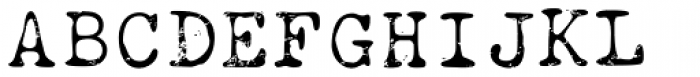
Why do we blink so frequently? Jungle
Free for personal use
Similar Fonts for Why do we blink so frequently? Dark from Adobe.com
Chandler42 Medium
$ Commercial > Adobe.com
Chandler42Regular Regular
$ Commercial > Adobe.com
Similar Fonts for Why do we blink so frequently? Dark from MyFonts.com
Obsolete Alternate Light
$ Commercial > MyFonts.com
FF Elementa Rough Pro
$ Commercial > MyFonts.com
Similar Fonts for Why do we blink so frequently? Dark from CreativeMarket.com
Restraining Order Pro AOE Regular otf (400)
$ Commercial > CreativeMarket.com

Typewriter 1950 Tech Mono RegPROmono otf (400)
$ Commercial > CreativeMarket.com


Did you know? We have indexed 99% of the world's fonts!