


Train to Nevada
2.88/5
1162 votes, rated based on results identification
Publisher
License
Free for personal use
Date added
Feb 17 2023
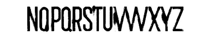
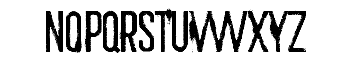
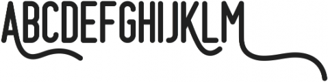
A distressed, bold, and condensed font with a grungy style. This font features a distressed, grungy style with uneven edges and a bold presence. The characters are tall and narrow, giving it a condensed appearance. It includes uppercase letters, numbers, and a selection of special characters.
Ideal for posters, album covers, or any design requiring a rugged, edgy look.
Headlines, Posters, Album Covers
Balanced
Download Train to Nevada font. Train to Nevada by
See the font with your own text
Category
Decorative/Display
Italic
No
Width
Condensed
Line height
Normal
Overall style
Grunge, Edgy
Cap height
High
Bold
Yes
Weight
Bold
Character spacing
Normal
Contrast
Low
X height
Medium
Proposed projects
Ideal for posters, album covers, or any design requiring a rugged, edgy look.
Use case
Headlines, Posters, Album Covers
Ascender descender ratio
Balanced
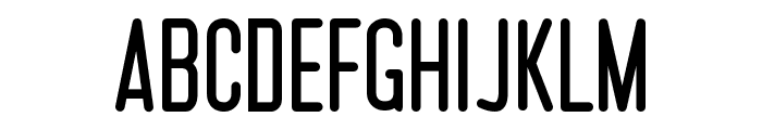
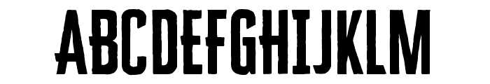
Similar Free Fonts for Train to Nevada
Train to Nevada
Free for personal use
MLB Phillies
Free for personal use
Similar Fonts for Train to Nevada from Adobe.com
Cheddar Gothic Sans Regular
$ Commercial > Adobe.com

Cheddar Gothic Serif Regular
$ Commercial > Adobe.com
Similar Fonts for Train to Nevada from MyFonts.com
Cream Opera Medium
$ Commercial > MyFonts.com

Cream Opera Regular
$ Commercial > MyFonts.com

Similar Fonts for Train to Nevada from CreativeMarket.com
Prestage otf (400)
$ Commercial > CreativeMarket.com

Grimtotem Clean otf (400)
$ Commercial > CreativeMarket.com


Did you know? We have indexed 99% of the world's fonts!