
Quastic Kaps Line
2.94/5
1992 votes, rated based on results identification
Publisher
License
Free for personal use
Date added
Jan 08 2017
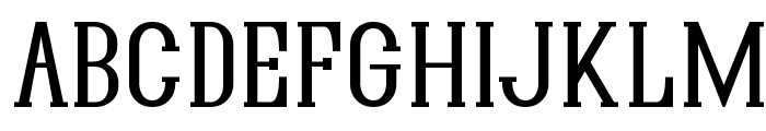
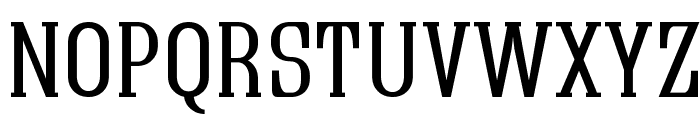
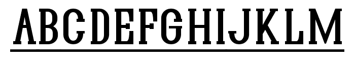
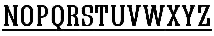
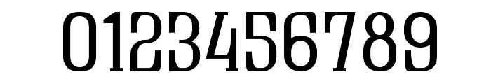
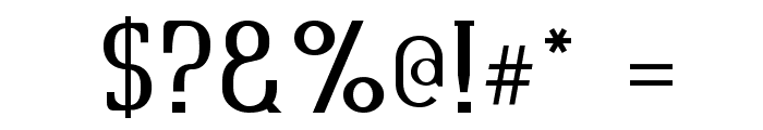
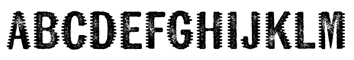
A bold, classic serif font with elongated characters. This font features bold, elongated characters with a classic serif style. The strokes are consistent in thickness, providing a strong and authoritative appearance. The uppercase letters are prominent, and the numerals are distinct with a slight curvature.
Ideal for headlines, posters, and branding materials that require a strong, classic look.
Headlines, Logos
Balanced
Download Quastic Kaps Line font. Quastic Kaps Line by Copyright [c] Graham Meade,,, 2003. All rights reserved.
See the font with your own text
Category
Serif
Italic
No
Width
Normal
Line height
Normal
Overall style
Classic
Cap height
High
Bold
Yes
Weight
Bold
Character spacing
Normal
Contrast
Low
X height
Medium
Proposed projects
Ideal for headlines, posters, and branding materials that require a strong, classic look.
Use case
Headlines, Logos
Ascender descender ratio
Balanced
Similar Free Fonts for Quastic Kaps Line
Quastic Kaps Line
Free for personal use
Lockon Velline
Free for personal use
Similar Fonts for Quastic Kaps Line from Adobe.com
Wausau Regular
$ Commercial > Adobe.com
Kiln Serif Spiked
$ Commercial > Adobe.com
Similar Fonts for Quastic Kaps Line from MyFonts.com
Industrial Gothic Std Single Line
$ Commercial > MyFonts.com

Industrial Gothic Pro Single Line
$ Commercial > MyFonts.com

Similar Fonts for Quastic Kaps Line from CreativeMarket.com
Lockon Velline otf (400)
$ Commercial > CreativeMarket.com

Knoxville Regular otf (400)
$ Commercial > CreativeMarket.com

Did you know? We have indexed 99% of the world's fonts!