


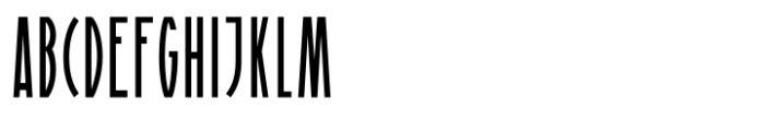
Playoff Display
2.93/5
1359 votes, rated based on results identification
Publisher
License
Free for personal use
Date added
Jan 14 2017
A tall, narrow, and geometric font with a modern style. This font features tall, narrow characters with a distinct, modern flair. The strokes are consistent in width, giving it a sleek and uniform appearance. The characters have sharp angles and a geometric style, making it ideal for attention-grabbing designs.
Ideal for headlines, posters, and branding projects that require a modern and striking look.
Headlines, Logos
Balanced
Download Playoff Display font. Playoff Display by Copyright [c] 2016 by HENRIavecunK. All rights reserved. To aquire a commercial license please contact henriavecunk@gmail.com.
See the font with your own text
Category
Decorative/Display
Italic
No
Width
Condensed
Line height
Tall
Overall style
Modern
Cap height
High
Bold
No
Weight
Regular
Character spacing
Normal
Contrast
Low
X height
Medium
Proposed projects
Ideal for headlines, posters, and branding projects that require a modern and striking look.
Use case
Headlines, Logos
Ascender descender ratio
Balanced
Similar Free Fonts for Playoff Display

Similar Fonts for Playoff Display from Adobe.com


Similar Fonts for Playoff Display from MyFonts.com

Similar Fonts for Playoff Display from CreativeMarket.com


Did you know? We have indexed 99% of the world's fonts!