


Norton
3.08/5
21776 votes, rated based on results identification
Publisher
License
Free for personal use
Date added
Jan 07 2017
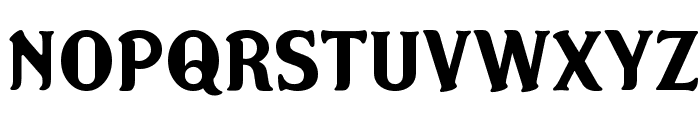
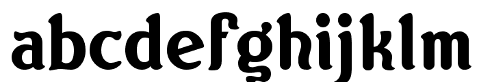
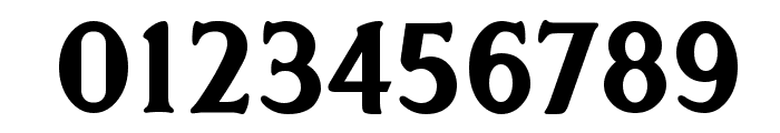
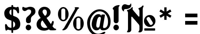
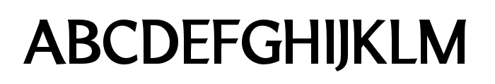
A bold serif font with rounded edges and moderate contrast. This font features bold, rounded serifs with a classic and slightly playful appearance. The characters are well-defined with a moderate contrast between thick and thin strokes, giving it a sturdy yet elegant look.
Ideal for headlines, posters, branding, and editorial design where a strong, classic presence is desired.
Headlines, Logos
Balanced
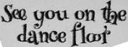
Download Norton font. Norton by Norton [version 1.01] by Keith Bates K Type Freebie 2006 " www.k type.com " keith@k type.com " Based on the
See the font with your own text
Category
Serif
Italic
No
Width
Normal
Line height
Normal
Overall style
Classic
Cap height
High
Bold
Yes
Weight
Bold
Character spacing
Normal
Contrast
Medium
X height
Medium
Proposed projects
Ideal for headlines, posters, branding, and editorial design where a strong, classic presence is desired.
Use case
Headlines, Logos
Ascender descender ratio
Balanced
Similar Free Fonts for Norton
Norton
Free for personal use
LTMarathon-Bold
Free for personal use
Similar Fonts for Norton from Adobe.com
Calendula Demi
$ Commercial > Adobe.com

Conglomerate Demi
$ Commercial > Adobe.com

Similar Fonts for Norton from MyFonts.com
Norton
$ Commercial > MyFonts.com

Grotesk Polski FA Bold
$ Commercial > MyFonts.com

Similar Fonts for Norton from CreativeMarket.com
Kalleesa Regular otf (400)
$ Commercial > CreativeMarket.com

Falige Bold otf (700)
$ Commercial > CreativeMarket.com


Did you know? We have indexed 99% of the world's fonts!