


I Think Im Turning Japanese
3.03/5
996 votes, rated based on results identification
Publisher
License
Free for personal use
Date added
Nov 26 2018
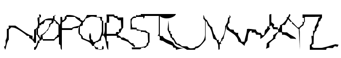
A jagged, fragmented font with a chaotic style. This font features a jagged, fragmented design that gives it a chaotic and edgy appearance. The characters are irregular and appear as if they are breaking apart, creating a unique visual effect.
Ideal for album covers, edgy posters, or any project requiring a bold, unconventional look.
Headlines, Posters, Album Covers
Balanced
Download I Think Im Turning Japanese font. I Think Im Turning Japanese by Generated by Fontographer 4.1
See the font with your own text
Category
Decorative/Display
Italic
No
Width
Normal
Line height
Normal
Overall style
Modern, Edgy
Cap height
High
Bold
No
Weight
Regular
Character spacing
Normal
Contrast
High
X height
Medium
Proposed projects
Ideal for album covers, edgy posters, or any project requiring a bold, unconventional look.
Use case
Headlines, Posters, Album Covers
Ascender descender ratio
Balanced
Similar Free Fonts for I Think Im Turning Japanese
I Think Im Turning Japanese
Free for personal use
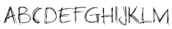
BusinessAsUsual
Free for personal use
Similar Fonts for I Think Im Turning Japanese from Adobe.com
Portofino ExtraLight
$ Commercial > Adobe.com

Montecatini Pro Ampio Medium
$ Commercial > Adobe.com

Similar Fonts for I Think Im Turning Japanese from MyFonts.com
Intro Rust L Fill 2 Line
$ Commercial > MyFonts.com

Business As Usual
$ Commercial > MyFonts.com

Similar Fonts for I Think Im Turning Japanese from CreativeMarket.com
Maya Sans otf (400)
$ Commercial > CreativeMarket.com

Single Twig Regular otf (400)
$ Commercial > CreativeMarket.com


Did you know? We have indexed 99% of the world's fonts!