
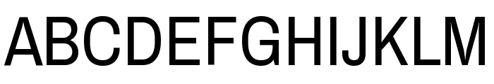
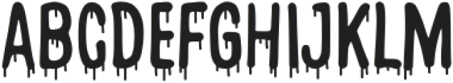
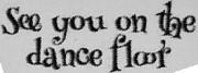
How Bout That
3.02/5
2278 votes, rated based on results identification
Publisher
License
Free for personal use
Date added
Jan 12 2017
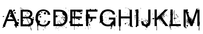
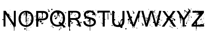
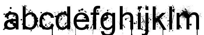
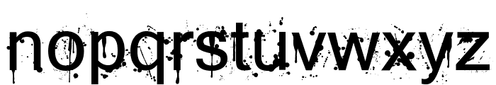
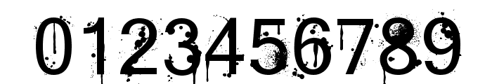
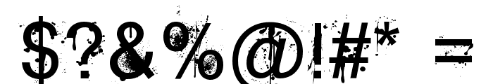
A grunge-style font with splatter effects and bold characters. This font features a distressed, grunge style with splatter effects, giving it an edgy and urban appearance. The characters are bold and uppercase letters are slightly taller than lowercase, with irregular edges that add to the chaotic aesthetic.
Ideal for music album covers, street art designs, edgy posters, and urban-themed branding.
Logos, Posters, Album Covers
Balanced
Download How Bout That font. How Bout That by © 2013 Jayde Garrow Fonts. All Rights Reserved
See the font with your own text
Category
Decorative/Display
Italic
No
Width
Normal
Line height
Normal
Overall style
Grunge, Urban
Cap height
High
Bold
Yes
Weight
Bold
Character spacing
Normal
Contrast
Low
X height
Medium
Proposed projects
Ideal for music album covers, street art designs, edgy posters, and urban-themed branding.
Use case
Logos, Posters, Album Covers
Ascender descender ratio
Balanced
Similar Free Fonts for How Bout That
How Bout That
Free for personal use
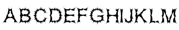
Satan Possessed
Free for personal use
Similar Fonts for How Bout That from Adobe.com
Hoss Round XNarrow Regular
$ Commercial > Adobe.com
Archivo Narrow Variable Regular
$ Commercial > Adobe.com
Similar Fonts for How Bout That from MyFonts.com
DINfun Pro Blade
$ Commercial > MyFonts.com

DINfun Pro Drips
$ Commercial > MyFonts.com

Similar Fonts for How Bout That from CreativeMarket.com
DropBlood Brush otf (400)
$ Commercial > CreativeMarket.com
Ride The Lightning-Light otf (300)
$ Commercial > CreativeMarket.com


Did you know? We have indexed 99% of the world's fonts!