


Knocked otf (400)
2.66/5
3479 votes, rated based on results identification
Publisher
CreativeMarket
License
Commercial
Date added
May 25 2023
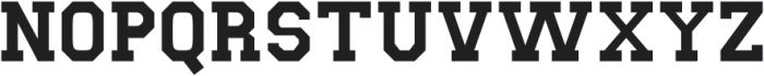
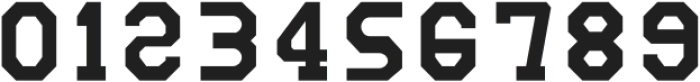
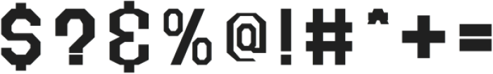
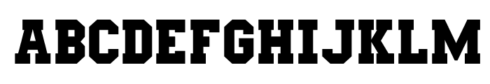
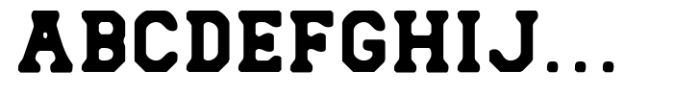
A bold, geometric font with uniform width and strong visual impact. This font features bold, blocky characters with a strong geometric structure. The uppercase and lowercase letters are uniform in width, creating a cohesive and impactful appearance. The numerals and special characters maintain the same bold style, enhancing the font's overall consistency.
Ideal for sports branding, posters, and headlines where a strong, assertive presence is needed.
Headlines, Logos
Balanced
Download Knocked otf (400) font. Knocked otf (400) by
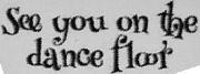
See the font with your own text

Category
Slab Serif
Italic
No
Width
Normal
Line height
Normal
Overall style
Modern
Cap height
High
Bold
Yes
Weight
Bold
Character spacing
Normal
Contrast
Low
X height
Medium
Proposed projects
Ideal for sports branding, posters, and headlines where a strong, assertive presence is needed.
Use case
Headlines, Logos
Ascender descender ratio
Balanced
Similar Free Fonts for Knocked otf (400)
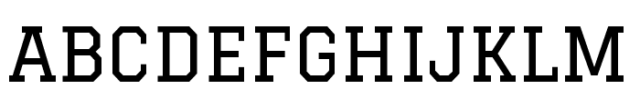
West Test
Free for personal use
Mars&Twist
Free for personal use
Similar Fonts for Knocked otf (400) from Adobe.com
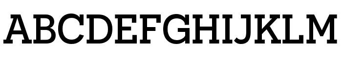
Graduate Regular
$ Commercial > Adobe.com
Novecento slab Medium
$ Commercial > Adobe.com
Similar Fonts for Knocked otf (400) from MyFonts.com
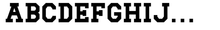
Knocked Regular
$ Commercial > MyFonts.com
Knocked Rough
$ Commercial > MyFonts.com
Similar Fonts for Knocked otf (400) from CreativeMarket.com
Knocked otf (400)
$ Commercial > CreativeMarket.com
Knocked-Rough otf (400)
$ Commercial > CreativeMarket.com

Did you know? We have indexed 99% of the world's fonts!