


FirmerRegular otf (400)
3.00/5
517 votes, rated based on results identification
Publisher
CreativeMarket
License
Commercial
Date added
May 17 2023
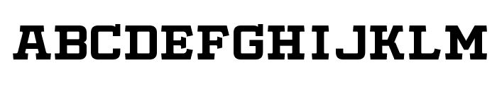
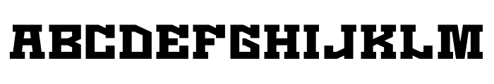
A bold, geometric font with uniform width and strong presence. This font features bold, blocky characters with a strong geometric structure. The uppercase and lowercase letters are uniform in width, creating a cohesive and impactful appearance. The numbers and special characters maintain the same bold style, ensuring consistency across all elements.
Ideal for posters, headlines, branding, and any project requiring a strong visual impact.
Headlines, Logos, Posters
Balanced
Download FirmerRegular otf (400) font. FirmerRegular otf (400) by
See the font with your own text

Category
Decorative/Display
Italic
No
Width
Normal
Line height
Normal
Overall style
Modern
Cap height
High
Bold
Yes
Weight
Bold
Character spacing
Normal
Contrast
Low
X height
Medium
Proposed projects
Ideal for posters, headlines, branding, and any project requiring a strong visual impact.
Use case
Headlines, Logos, Posters
Ascender descender ratio
Balanced
Similar Free Fonts for FirmerRegular otf (400)
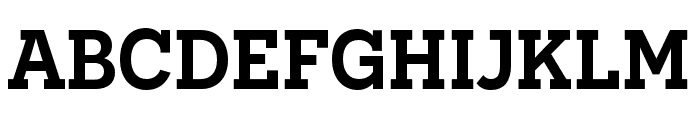
Slabby Prices Regular
Free for personal use
Kaizen Seisaku
Free for personal use
Similar Fonts for FirmerRegular otf (400) from Adobe.com
Novecento slab wide DemiBold
$ Commercial > Adobe.com

Novecento slab DemiBold
$ Commercial > Adobe.com
Similar Fonts for FirmerRegular otf (400) from MyFonts.com
Winner Bold
$ Commercial > MyFonts.com

Winner Extra Bold
$ Commercial > MyFonts.com

Similar Fonts for FirmerRegular otf (400) from CreativeMarket.com
FirmerRegular otf (400)
$ Commercial > CreativeMarket.com
ROTTERDAM REDEMPTION otf (400)
$ Commercial > CreativeMarket.com


Did you know? We have indexed 99% of the world's fonts!