


Be Quite Duration ttf (400)
2.90/5
187 votes, rated based on results identification
Publisher
CreativeMarket
License
Commercial
Date added
Mar 30 2024
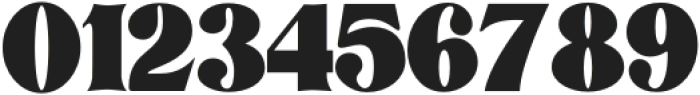
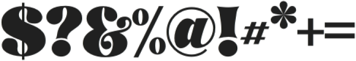
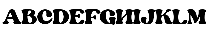
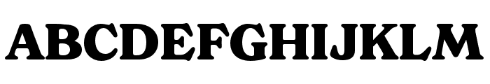
A bold, high-contrast serif font with a vintage flair. This font features bold, thick strokes with a high contrast between thick and thin lines. The serifs are prominent and exaggerated, giving it a dramatic and decorative appearance. The characters are tightly spaced, and the overall style is reminiscent of vintage or retro design.
Ideal for poster headlines, branding, and logo design where a strong, impactful presence is needed.
Headlines, Logos
Balanced
Download Be Quite Duration ttf (400) font. Be Quite Duration ttf (400) by Absonstype123
See the font with your own text

Category
Serif
Italic
No
Width
Normal
Line height
Short
Overall style
Vintage
Cap height
High
Bold
Yes
Weight
Bold
Character spacing
Tight
Contrast
High
X height
Medium
Proposed projects
Ideal for poster headlines, branding, and logo design where a strong, impactful presence is needed.
Use case
Headlines, Logos
Ascender descender ratio
Balanced
Similar Free Fonts for Be Quite Duration ttf (400)
Similar Fonts for Be Quite Duration ttf (400) from Adobe.com

Similar Fonts for Be Quite Duration ttf (400) from MyFonts.com
Similar Fonts for Be Quite Duration ttf (400) from CreativeMarket.com


Did you know? We have indexed 99% of the world's fonts!