
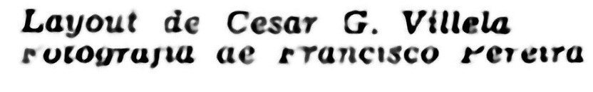
Pay attentio on "y" and "g".
Maybe or unanswered
1 year ago
1 reply (1 year ago)
Description
Sorry for this smoothed picture, is the only I got. The "y" is very unusual, it have it's left top line inclined, not parallel to the right line. The left top line is thick at the top and goes thin down. The leg from the "y" is very short, almost touching the baseline, the space between the leg and base line is very small, so the leg from "g" also have this feature. I found Plantin Infant Bold Italic from Monotype, but the "y" from that is parallel tho the right line, and the top and base from the left line have the same thickness.
Responses
WhatFontis
1 year ago
Hello Please post a link to initial big and clear image. Alex


Did you know? We have indexed 99% of the world's fonts!