
italic feminine font, letters connect
Maybe or unanswered
12 years ago
2 replies (12 years ago)
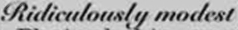
Description
Sorry about the image quality.. It reads \"ridiculously modest\" and the letters are somewhat close together and connect. All of the thick upright parts like i, l, and the m have a very uniform thickness except at the top and bottoms.. I hope that makes sense, I don\'t know all the correct terminology!
Responses
WhatFontis
12 years ago
Hello
Maybe you can use:
http://www.whatfontis.com/G-Unit.font?text=Ridiculously%20modest
Alex
yankeecreampie
12 years ago
Beautiful!!! THANK YOU!
Our latest blog articles
Latest from the forum

Did you know? We have indexed 99% of the world's fonts!