
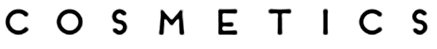
Sans font with a hint of Art Deco styling.
Solved
6 years ago
3 replies (6 years ago)
Somewhere between Futura (the cap S), Avenir (the cap C) and a deco-style font (the cap E). Any ideas? I've had to blur/resharpen this quite extensively to get something even close to being usable by the font-recognition engine here, so disregard the 'rounded' feel to the end of strokes - they're actually squared off on the original tiny PNG I have.
Responses
MRES
6 years ago
Additional info: this line comes from the Jordana Ticia Cosmetics logo if it's any help.
JohnnyC
6 years ago
MRES
6 years ago
Perfect! I ended up redrawing it yesterday, but I'll use the proper font instead now - it's blowing up a few metres across so it'll make a noticeable difference, thanks very much. :)
Did you know? We have indexed 99% of the world's fonts!