


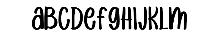
Why Kee Kee (plain)
2.90/5
1339 votes, rated based on results identification
Publisher
T26
License
Commercial
Date added
Sep 17 2018
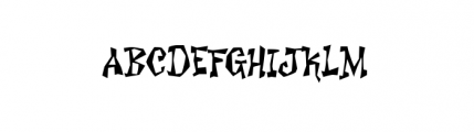
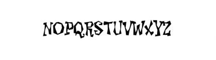
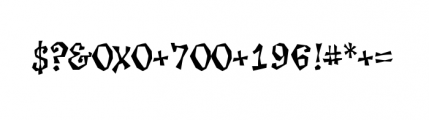
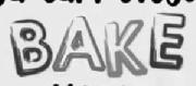
A playful, hand-drawn font with jagged edges and bold characters. This font features a playful and quirky style with irregular, jagged edges and a hand-drawn appearance. The characters are bold and slightly condensed, giving it a unique and eye-catching look.
Ideal for children's books, comic strips, playful branding, and creative posters.
Headlines, Logos, Posters
Balanced
Download Why Kee Kee (plain) font. Why Kee Kee (plain) by One Way Out
See the font with your own text

Category
Decorative/Display
Italic
No
Width
Condensed
Line height
Normal
Overall style
Playful, Quirky
Cap height
High
Bold
Yes
Weight
Bold
Character spacing
Normal
Contrast
Medium
X height
Medium
Proposed projects
Ideal for children's books, comic strips, playful branding, and creative posters.
Use case
Headlines, Logos, Posters
Ascender descender ratio
Balanced
Similar Free Fonts for Why Kee Kee (plain)
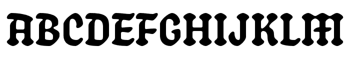
Playtime Regular
Free for personal use
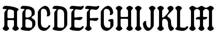
raindrops
Free for personal use
Similar Fonts for Why Kee Kee (plain) from Adobe.com
Schmaltzy Regular
$ Commercial > Adobe.com
Schmaltzy Extra Light
$ Commercial > Adobe.com
Similar Fonts for Why Kee Kee (plain) from MyFonts.com
Sorvettero Diamond
$ Commercial > MyFonts.com

Karo OT Line
$ Commercial > MyFonts.com
Similar Fonts for Why Kee Kee (plain) from CreativeMarket.com
Pink Lady Sans otf (400)
$ Commercial > CreativeMarket.com

LoveAyu-Display otf (400)
$ Commercial > CreativeMarket.com


Did you know? We have indexed 99% of the world's fonts!