


zp consideration print bold
2.90/5
3062 votes, rated based on results identification
Publisher
SilhouetteDesignStore
License
Commercial
Date added
Feb 14 2019
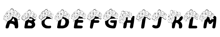
A playful, rounded handwritten font with consistent stroke width. This font features a playful and rounded style with a handwritten appearance. The characters have a consistent stroke width, giving it a smooth and friendly look. The uppercase letters are slightly taller than the lowercase, and the numbers are clear and legible.
Ideal for children's books, playful branding, greeting cards, and informal invitations.
Headlines, Logos
Balanced
Download zp consideration print bold font. zp consideration print bold by ScrapNfonts
See the font with your own text
Category
Handwritten
Italic
No
Width
Normal
Line height
Normal
Overall style
Playful
Cap height
High
Bold
Yes
Weight
Bold
Character spacing
Normal
Contrast
Low
X height
Medium
Proposed projects
Ideal for children's books, playful branding, greeting cards, and informal invitations.
Use case
Headlines, Logos
Ascender descender ratio
Balanced
Similar Free Fonts for zp consideration print bold
Similar Fonts for zp consideration print bold from Adobe.com


Similar Fonts for zp consideration print bold from MyFonts.com


Similar Fonts for zp consideration print bold from CreativeMarket.com


Did you know? We have indexed 99% of the world's fonts!