
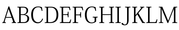
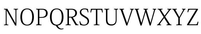
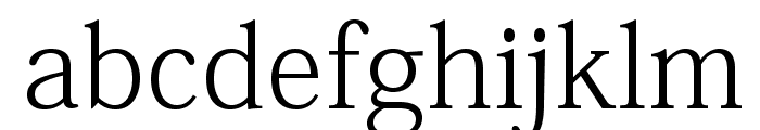
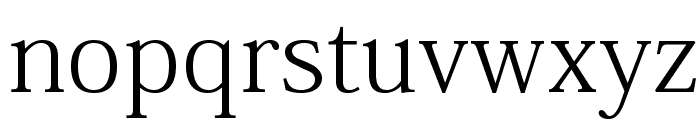
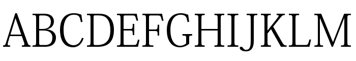
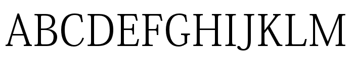
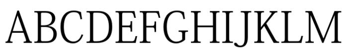
RyoTextPlusN-Light
2.89/5
7847 votes, rated based on results identification
Publisher
from Adobe Font Folio
License
Commercial
Date added
Jan 20 2017
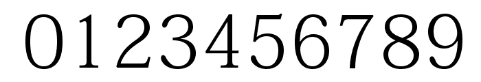
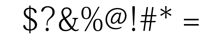
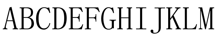
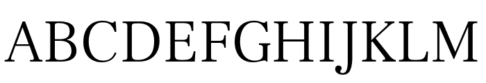
A classic serif font with balanced proportions and moderate contrast. This font features a clean and elegant serif style with balanced proportions. The characters have a classic appearance with moderate stroke contrast, making it suitable for both digital and print media. The design is refined, with a focus on readability and sophistication.
Ideal for editorial design, book typesetting, formal invitations, and branding projects.
Body text, Headlines, Editorial design
Balanced
Download RyoTextPlusN-Light font. RyoTextPlusN-Light by Copyright ? 1997-2007 Adobe Systems Incorporated. All Rights Reserved.
See the font with your own text
Category
Serif
Italic
No
Width
Normal
Line height
Normal
Overall style
Classic
Cap height
High
Bold
No
Weight
Light
Character spacing
Normal
Contrast
Medium
X height
Medium
Proposed projects
Ideal for editorial design, book typesetting, formal invitations, and branding projects.
Use case
Body text, Headlines, Editorial design
Ascender descender ratio
Balanced
Similar Free Fonts for RyoTextPlusN-Light
Similar Fonts for RyoTextPlusN-Light from Adobe.com
Similar Fonts for RyoTextPlusN-Light from MyFonts.com

Similar Fonts for RyoTextPlusN-Light from CreativeMarket.com


Our latest blog articles
Latest from the forum


Did you know? We have indexed 99% of the world's fonts!