
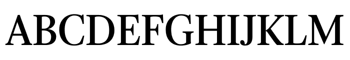
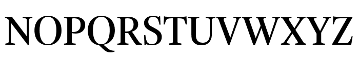
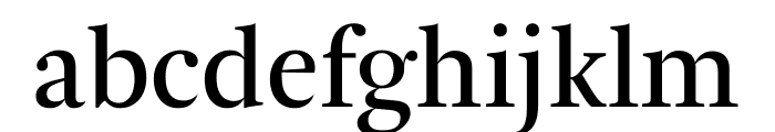
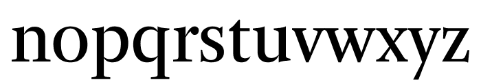
Arnhem Display Normal
2.86/5
9950 votes, rated based on results identification
Publisher
typeby.com
License
Commercial
Date added
Jan 26 2020
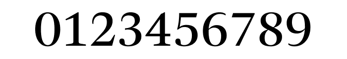
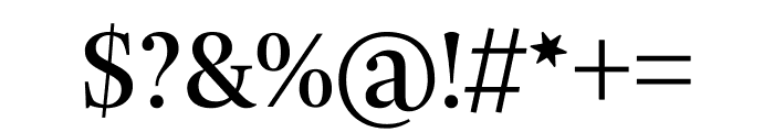
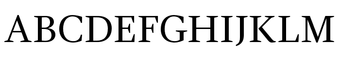
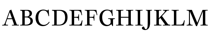
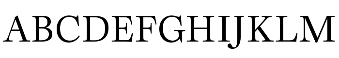
A classic serif font with elegant, sharp serifs and balanced proportions. This font features a classic serif style with elegant, sharp serifs and a balanced proportion. The characters are well-defined with a moderate contrast in stroke thickness, providing a sophisticated and readable appearance.
Ideal for editorial design, book covers, and formal invitations.
Headlines, Body text
Balanced
Download Arnhem Display Normal font. Arnhem Display Normal by Copyright (c) 1998-2017. All rights reserved. ARNHEM DISPLAY is a design by Fred Smeijers, published by TYPE BY.
See the font with your own text
Category
Serif
Italic
No
Width
Normal
Line height
Normal
Overall style
Classic
Cap height
High
Bold
No
Weight
Regular
Character spacing
Normal
Contrast
Medium
X height
Medium
Proposed projects
Ideal for editorial design, book covers, and formal invitations.
Use case
Headlines, Body text
Ascender descender ratio
Balanced
Similar Free Fonts for Arnhem Display Normal
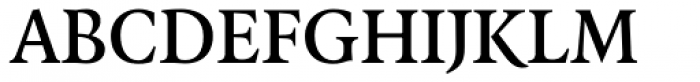
GandhiSerif-Regular
Free for personal use
LibreCaslonText-Regular
Free for personal use
Similar Fonts for Arnhem Display Normal from Adobe.com
Joly Headline Medium
$ Commercial > Adobe.com
Joly Headline Regular
$ Commercial > Adobe.com
Similar Fonts for Arnhem Display Normal from MyFonts.com
FF Quadraat OT DemiBold
$ Commercial > MyFonts.com
FF Quadraat Pro DemiBold
$ Commercial > MyFonts.com

Similar Fonts for Arnhem Display Normal from CreativeMarket.com
Editor's Note Text Regular otf (400)
$ Commercial > CreativeMarket.com

Perfectly Nineties Regular otf (400)
$ Commercial > CreativeMarket.com


Did you know? We have indexed 99% of the world's fonts!