


Why Square Std Thin
2.76/5
646 votes, rated based on results identification
Publisher
Myfonts.com
License
Commercial
Date added
Dec 05 2016
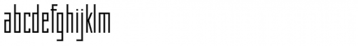
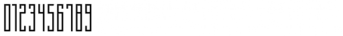
A thin, geometric font with a modern and minimalist design. This font features a geometric and modern design with a thin, square-like structure. The characters are tall and narrow, giving it a sleek and contemporary appearance. The uniform stroke width and sharp angles contribute to its clean and minimalist style.
Ideal for modern branding, tech-related projects, and minimalist design layouts.
Headlines, Logos
Balanced
Download Why Square Std Thin font.
See the font with your own text
Category
Sans-Serif
Italic
No
Width
Condensed
Line height
Tall
Overall style
Modern
Cap height
High
Bold
No
Weight
Light
Character spacing
Normal
Contrast
Low
X height
Medium
Proposed projects
Ideal for modern branding, tech-related projects, and minimalist design layouts.
Use case
Headlines, Logos
Ascender descender ratio
Balanced
Similar Free Fonts for Why Square Std Thin


Similar Fonts for Why Square Std Thin from Adobe.com


Similar Fonts for Why Square Std Thin from MyFonts.com


Similar Fonts for Why Square Std Thin from CreativeMarket.com


Did you know? We have indexed 99% of the world's fonts!