


Science Fair JNL Regular
2.86/5
7227 votes, rated based on results identification
Publisher
FontSpring.com
License
Commercial
Date added
Dec 19 2016
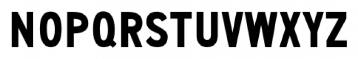
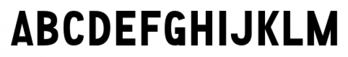
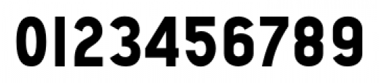
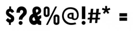
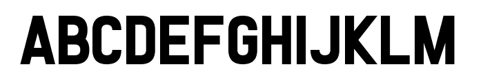
A bold, geometric font with consistent stroke widths and clean lines. This font features bold, uppercase letters with a strong, geometric structure. The characters are evenly spaced with consistent stroke widths, providing a clean and modern appearance. The numerals and special characters maintain the same boldness and clarity.
Ideal for posters, headlines, branding, and signage where a strong visual impact is needed.
Headlines, Logos, Posters
Balanced
Download Science Fair JNL Regular font. Science Fair JNL Regular by Jeff Levine Fonts
See the font with your own text
Category
Sans-Serif
Italic
No
Width
Normal
Line height
Normal
Overall style
Modern
Cap height
High
Bold
Yes
Weight
Bold
Character spacing
Normal
Contrast
Low
X height
Medium
Proposed projects
Ideal for posters, headlines, branding, and signage where a strong visual impact is needed.
Use case
Headlines, Logos, Posters
Ascender descender ratio
Balanced
Similar Free Fonts for Science Fair JNL Regular
SF Atarian System Bold
Free for personal use

Gourmet Hearth
Free for personal use
Similar Fonts for Science Fair JNL Regular from Adobe.com
Diazo MVB Rough2 Cond Bold
$ Commercial > Adobe.com

Diazo MVB Ex Cond Bold
$ Commercial > Adobe.com
Similar Fonts for Science Fair JNL Regular from MyFonts.com
Science Fair JNL
$ Commercial > MyFonts.com

Shaimus Rough
$ Commercial > MyFonts.com

Similar Fonts for Science Fair JNL Regular from CreativeMarket.com
Blockers Regular otf (400)
$ Commercial > CreativeMarket.com

Aldivaro ttf (400)
$ Commercial > CreativeMarket.com

Did you know? We have indexed 99% of the world's fonts!