


Salt & Spices Mono SC Serif
2.94/5
1703 votes, rated based on results identification
Publisher
FontSpring.com
License
Commercial
Date added
Dec 19 2016
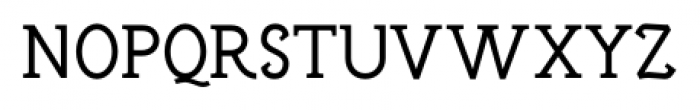
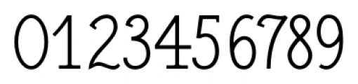
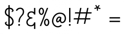
A classic serif font with sharp serifs and balanced proportions. This font features a classic serif style with distinct, sharp serifs and a balanced structure. The uppercase letters are tall and elegant, while the lowercase letters maintain a consistent and readable form. The numerals are clear and well-proportioned, and the special characters are designed to complement the overall aesthetic.
Ideal for editorial design, book covers, and formal invitations.
Headlines, Body text
Balanced
Download Salt & Spices Mono SC Serif font. Salt & Spices Mono SC Serif by Fontforecast
See the font with your own text
Category
Serif
Italic
No
Width
Normal
Line height
Normal
Overall style
Classic
Cap height
High
Bold
No
Weight
Regular
Character spacing
Normal
Contrast
Medium
X height
Medium
Proposed projects
Ideal for editorial design, book covers, and formal invitations.
Use case
Headlines, Body text
Ascender descender ratio
Balanced
Similar Free Fonts for Salt & Spices Mono SC Serif
Clunk
Free for personal use

Colton Small Capitals
Free for personal use

Similar Fonts for Salt & Spices Mono SC Serif from Adobe.com
Domus Titling Light
$ Commercial > Adobe.com

AWConqueror Std Slab Light
$ Commercial > Adobe.com

Similar Fonts for Salt & Spices Mono SC Serif from MyFonts.com
Salt & Spices Mono SC Serif
$ Commercial > MyFonts.com

Salt & Spices Mono SC
$ Commercial > MyFonts.com

Similar Fonts for Salt & Spices Mono SC Serif from CreativeMarket.com
Salt and Spices Mono SC Serif otf (400)
$ Commercial > CreativeMarket.com

Naive Line Black otf (900)
$ Commercial > CreativeMarket.com


Did you know? We have indexed 99% of the world's fonts!