


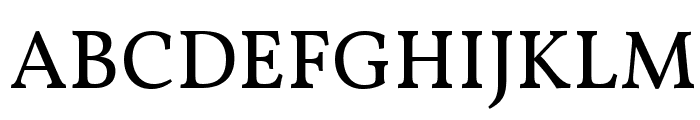
Rieux Minus SemiBold
2.86/5
4528 votes, rated based on results identification
Publisher
FontSpring.com
License
Commercial
Date added
Dec 19 2016
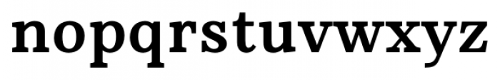
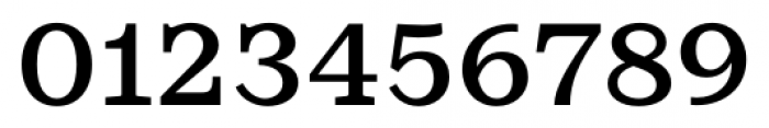
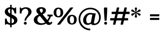
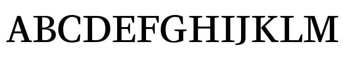
A semi-bold serif font with a classic and formal style. This font features a classic serif style with semi-bold weight, offering a balanced and readable appearance. The characters have a traditional structure with prominent serifs, providing a sense of formality and elegance.
Ideal for editorial design, book covers, formal invitations, and branding projects requiring a touch of elegance.
Headlines, Body text
Balanced
Download Rieux Minus SemiBold font. Rieux Minus SemiBold by Tetradtype
See the font with your own text
Category
Serif
Italic
No
Width
Normal
Line height
Normal
Overall style
Classic
Cap height
High
Bold
Yes
Character spacing
Normal
Contrast
Medium
X height
Medium
Proposed projects
Ideal for editorial design, book covers, formal invitations, and branding projects requiring a touch of elegance.
Use case
Headlines, Body text
Ascender descender ratio
Balanced
Similar Free Fonts for Rieux Minus SemiBold
CeriseOpti-Regular
Free for personal use
Vollkorn Regular
Free for personal use
Similar Fonts for Rieux Minus SemiBold from Adobe.com
KazimirText Medium
$ Commercial > Adobe.com
KazimirText Semibold
$ Commercial > Adobe.com

Similar Fonts for Rieux Minus SemiBold from MyFonts.com
Rieux Semi Bold
$ Commercial > MyFonts.com

Rieux Medium
$ Commercial > MyFonts.com

Similar Fonts for Rieux Minus SemiBold from CreativeMarket.com
Traditional and Exceptional Font - Regular Regular otf (400)
$ Commercial > CreativeMarket.com

Martin otf (400)
$ Commercial > CreativeMarket.com


Did you know? We have indexed 99% of the world's fonts!