


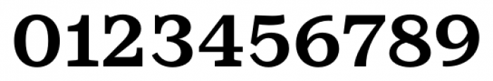
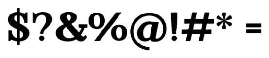
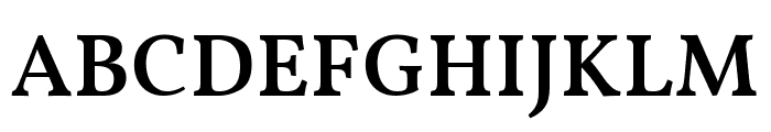
Rieux Minus Bold
2.88/5
5081 votes, rated based on results identification
Publisher
FontSpring.com
License
Commercial
Date added
Dec 19 2016
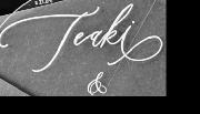
A bold serif font with a classic and authoritative style. This font features bold, strong serifs with a classic and authoritative appearance. The characters are well-defined with a consistent stroke width, giving it a robust and traditional look. The uppercase letters are slightly taller than the lowercase, and the numbers are clear and legible.
Ideal for headlines, book covers, and formal invitations.
Headlines, Logos
Balanced
Download Rieux Minus Bold font. Rieux Minus Bold by Tetradtype
See the font with your own text
Category
Serif
Italic
No
Width
Normal
Line height
Normal
Overall style
Classic
Cap height
High
Bold
Yes
Weight
Bold
Character spacing
Normal
Contrast
Low
X height
Medium
Proposed projects
Ideal for headlines, book covers, and formal invitations.
Use case
Headlines, Logos
Ascender descender ratio
Balanced
Similar Free Fonts for Rieux Minus Bold
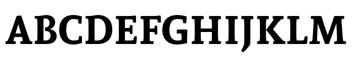
Vollkorn Medium
Free for personal use
Andada Bold
Free for personal use
Similar Fonts for Rieux Minus Bold from Adobe.com
KazimirText Semibold
$ Commercial > Adobe.com

KazimirText Bold
$ Commercial > Adobe.com

Similar Fonts for Rieux Minus Bold from MyFonts.com
Rieux Bold
$ Commercial > MyFonts.com

Rieux Semi Bold
$ Commercial > MyFonts.com

Similar Fonts for Rieux Minus Bold from CreativeMarket.com
Schorel Norm Black otf (900)
$ Commercial > CreativeMarket.com

Schorel Ext ExBold otf (700)
$ Commercial > CreativeMarket.com


Did you know? We have indexed 99% of the world's fonts!