
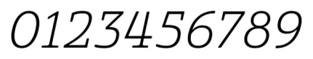
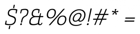
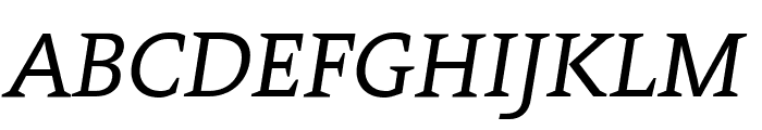
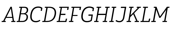
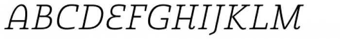
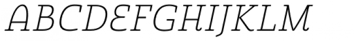
Quatie Norm Light Italic
2.66/5
390 votes, rated based on results identification
Publisher
FontSpring.com
License
Commercial
Date added
Dec 18 2016
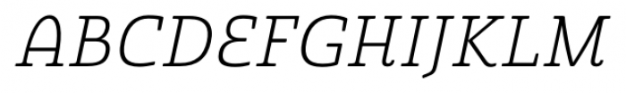
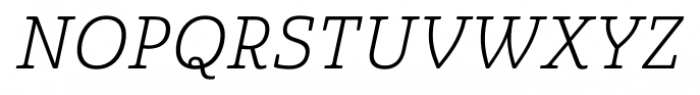
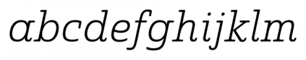
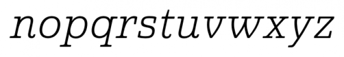
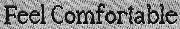
A light, italic serif font with elegant curves and balanced proportions. This font features a clean and elegant design with a slight slant, giving it an italicized appearance. The strokes are light and consistent, providing a refined and sophisticated look. The characters have a classic serif style with smooth curves and balanced proportions.
Ideal for formal invitations, elegant branding, and editorial design.
Headlines, Body text, Editorial design
Balanced
Download Quatie Norm Light Italic font. Quatie Norm Light Italic by Insigne Design
See the font with your own text
Category
Serif
Italic
Yes
Width
Normal
Line height
Normal
Overall style
Classic
Cap height
High
Bold
No
Weight
Light
Character spacing
Normal
Contrast
Medium
X height
Medium
Proposed projects
Ideal for formal invitations, elegant branding, and editorial design.
Use case
Headlines, Body text, Editorial design
Ascender descender ratio
Balanced
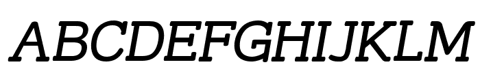
Similar Free Fonts for Quatie Norm Light Italic
Street Slab Italic
Free for personal use
Contra Italic
Free for personal use
Similar Fonts for Quatie Norm Light Italic from Adobe.com
Yorkten Slab Norm Light Ital
$ Commercial > Adobe.com
Yorkten Slab Cond Light Ital
$ Commercial > Adobe.com

Similar Fonts for Quatie Norm Light Italic from MyFonts.com
Quatie Light Italic
$ Commercial > MyFonts.com
Quatie Thin Italic
$ Commercial > MyFonts.com
Similar Fonts for Quatie Norm Light Italic from CreativeMarket.com
Quatie otf (400)
$ Commercial > CreativeMarket.com
Yorkten Slab Ext Book Ital otf (400)
$ Commercial > CreativeMarket.com


Did you know? We have indexed 99% of the world's fonts!