
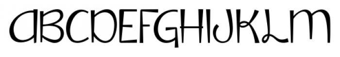
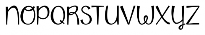
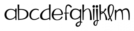
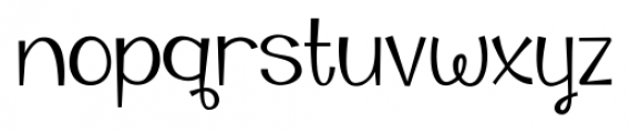
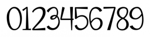
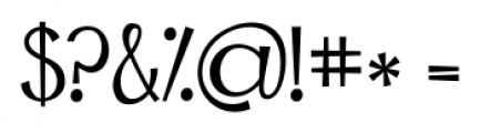
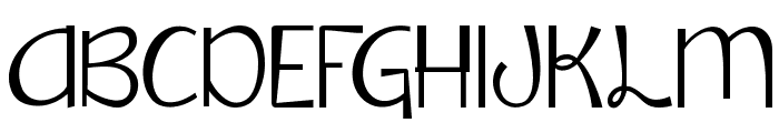
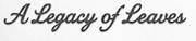
KG Falling Slowly Regular
3.03/5
1653 votes, rated based on results identification
Publisher
FontSpring.com
License
Commercial
Date added
Dec 17 2016
A playful, hand-drawn style font with rounded edges and consistent stroke weight. This font features a playful and whimsical style with rounded edges and a slightly irregular baseline. The characters have a hand-drawn appearance, adding a friendly and approachable feel. The strokes are consistent in weight, providing a balanced look.
Ideal for children's books, playful branding, greeting cards, and casual invitations.
Headlines, Logos
Moderate
Download KG Falling Slowly Regular font. KG Falling Slowly Regular by Kimberly Geswein Fonts
See the font with your own text
Category
Handwritten
Italic
No
Width
Normal
Line height
Normal
Overall style
Playful
Cap height
High
Bold
No
Weight
Regular
Character spacing
Normal
Contrast
Low
X height
Medium
Proposed projects
Ideal for children's books, playful branding, greeting cards, and casual invitations.
Use case
Headlines, Logos
Ascender descender ratio
Moderate
Similar Free Fonts for KG Falling Slowly Regular
KG Falling Slowly
Free for personal use
Sukima
Free for personal use
Similar Fonts for KG Falling Slowly Regular from Adobe.com
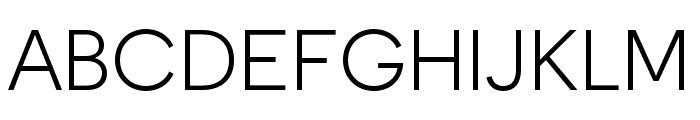
Liebling Light
$ Commercial > Adobe.com
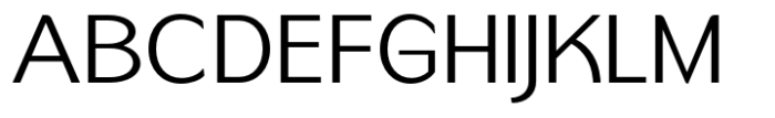
Halcom Book
$ Commercial > Adobe.com

Similar Fonts for KG Falling Slowly Regular from MyFonts.com
KG Falling Slowly
$ Commercial > MyFonts.com

Patihan Sans Light
$ Commercial > MyFonts.com
Similar Fonts for KG Falling Slowly Regular from CreativeMarket.com
SK Clarke Thin ttf (100)
$ Commercial > CreativeMarket.com

Patihan Sans Light otf (300)
$ Commercial > CreativeMarket.com


Did you know? We have indexed 99% of the world's fonts!