


Framingham JNL Regular
3.12/5
6094 votes, rated based on results identification
Publisher
FontSpring.com
License
Commercial
Date added
Dec 17 2016
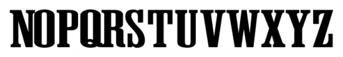
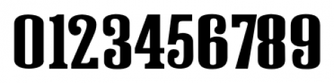
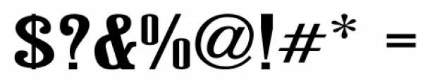
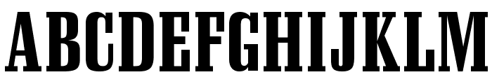
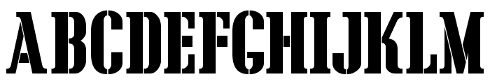
A bold, slab serif font with strong, squared serifs. This font features bold, slab serif characters with a strong presence. The letters are tall and narrow, with thick vertical strokes and slightly thinner horizontal strokes. The serifs are prominent and squared, adding to the font's robust appearance.
Ideal for headlines, posters, and branding materials that require a strong, impactful typeface.
Headlines, Logos
Balanced
Download Framingham JNL Regular font. Framingham JNL Regular by Jeff Levine Fonts
See the font with your own text
Category
Slab Serif
Italic
No
Width
Condensed
Line height
Tall
Overall style
Classic
Cap height
High
Bold
Yes
Weight
Bold
Character spacing
Normal
Contrast
Medium
X height
Medium
Proposed projects
Ideal for headlines, posters, and branding materials that require a strong, impactful typeface.
Use case
Headlines, Logos
Ascender descender ratio
Balanced
Similar Free Fonts for Framingham JNL Regular
NFL Eagles
Free for personal use
CargoCrate
Free for personal use
Similar Fonts for Framingham JNL Regular from Adobe.com
Council OT WordLogosOne
$ Commercial > Adobe.com

Council OT Regular
$ Commercial > Adobe.com

Similar Fonts for Framingham JNL Regular from MyFonts.com
Framingham JNL
$ Commercial > MyFonts.com

Work Force JNL
$ Commercial > MyFonts.com

Similar Fonts for Framingham JNL Regular from CreativeMarket.com
Pale Horse Sirloin otf (400)
$ Commercial > CreativeMarket.com

Thistlecreek otf (400)
$ Commercial > CreativeMarket.com

Did you know? We have indexed 99% of the world's fonts!