

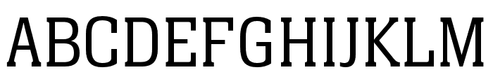
Eponymous Regular
2.90/5
5140 votes, rated based on results identification
Publisher
FontSpring.com
License
Free for commercial use
Date added
Dec 16 2016
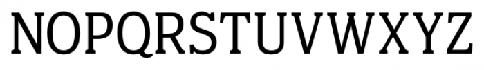
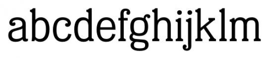
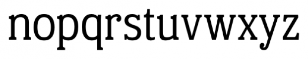
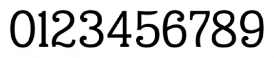
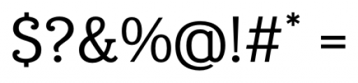
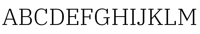
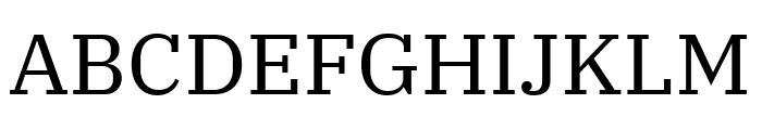
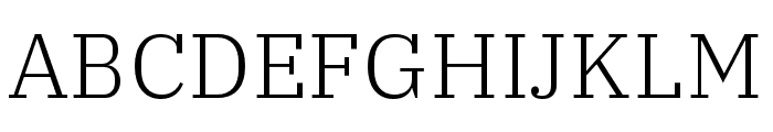
A classic serif font with balanced proportions and moderate contrast. This font features a classic serif style with balanced proportions and clear legibility. The strokes are well-defined, with moderate contrast between thick and thin lines, giving it a timeless and professional appearance.
Ideal for editorial design, book covers, formal invitations, and corporate branding.
Body text, Headlines
Balanced
Download Eponymous Regular font. Eponymous Regular by Paulo Goode
See the font with your own text
Category
Serif
Italic
No
Width
Normal
Line height
Normal
Overall style
Classic
Cap height
High
Bold
No
Weight
Regular
Character spacing
Normal
Contrast
Medium
X height
Medium
Proposed projects
Ideal for editorial design, book covers, formal invitations, and corporate branding.
Use case
Body text, Headlines
Ascender descender ratio
Balanced
Similar Free Fonts for Eponymous Regular
IBM Plex Serif Light
Free for personal use
IBM Plex Serif
Free for personal use
Similar Fonts for Eponymous Regular from Adobe.com
IBM Plex Serif Light
$ Commercial > Adobe.com
Neue Aachen Pro Light
$ Commercial > Adobe.com
Similar Fonts for Eponymous Regular from MyFonts.com
Eponymous Regular
$ Commercial > MyFonts.com

Eponymous Light
$ Commercial > MyFonts.com

Similar Fonts for Eponymous Regular from CreativeMarket.com
Eponymous otf (400)
$ Commercial > CreativeMarket.com

Eponymous Light otf (300)
$ Commercial > CreativeMarket.com


Did you know? We have indexed 99% of the world's fonts!