


Kaisei Tokumin 700
2.83/5
1752 votes, rated based on results identification
Publisher
Google Fonts
License
Free for commercial use
Date added
Nov 10 2021
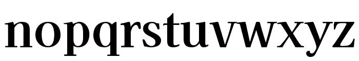
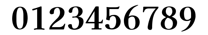
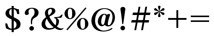
A classic serif font with balanced structure and moderate contrast. This font features a classic serif design with strong, clean lines and a balanced structure. The characters are well-defined, with a moderate contrast between thick and thin strokes, giving it a traditional yet modern appearance.
Ideal for editorial design, book covers, formal invitations, and branding projects.
Headlines, Body text, Logos
Balanced
Download Kaisei Tokumin 700 font. Kaisei Tokumin 700 by Copyright 2020 The Kaisei Project Authors (https://github.com/Font-Kai/Kaisei)
See the font with your own text
Category
Serif
Italic
No
Width
Normal
Line height
Normal
Overall style
Classic
Cap height
High
Bold
Yes
Weight
Bold
Character spacing
Normal
Contrast
Medium
X height
Medium
Proposed projects
Ideal for editorial design, book covers, formal invitations, and branding projects.
Use case
Headlines, Body text, Logos
Ascender descender ratio
Balanced
Similar Free Fonts for Kaisei Tokumin 700
Chapaza Regular
Free for personal use

Agatho Medium
Free for personal use

Similar Fonts for Kaisei Tokumin 700 from Adobe.com
Kaisei Opti Bold
$ Commercial > Adobe.com

Kaisei HarunoUmi Bold
$ Commercial > Adobe.com

Similar Fonts for Kaisei Tokumin 700 from MyFonts.com
Diem Gibling Regular
$ Commercial > MyFonts.com

Pax SemiBold
$ Commercial > MyFonts.com

Similar Fonts for Kaisei Tokumin 700 from CreativeMarket.com
MikonvisYonga-Regular otf (400)
$ Commercial > CreativeMarket.com

DiemGibling-Regular otf (400)
$ Commercial > CreativeMarket.com


Did you know? We have indexed 99% of the world's fonts!